Activator Admin Portal
Intro
Activator Admin Platform is an essential tool that enables various users, administrators, and managers to effectively manage the platform. Key features include user management, system configuration, data management, module customization, monitoring and reporting, as well as integration management. With this platform, administrators, users, and managers can control all aspects of the solution.
Activator Admin offers an intuitive user interface, enabling efficient management of components, and thereby facilitating the platform's use to meet the varied needs of each user. It is through the Activator Admin portal that all components take shape. This portal provides a centralized space where users can create, customize, and manage components according to their specific needs. In Activator Admin, the concept of component lies at the core of its development approach, representing the fundamental elements that constitute the platform's infrastructure. Here, components are pre-built elements ready for use, each with its own functionality and characteristics; They are designed to be reusable and configurable. Components are not limited to being mere individual elements; they also encompass specific functionalities and methods. In other words, each component in Activator Admin is both a entity and a functional unit, capable of executing actions and providing specific services within the platform. These integrated functionalities and methods make components dynamic and versatile elements, thus contributing to the richness of the user experience in Activator Admin.
Architecture of Activator
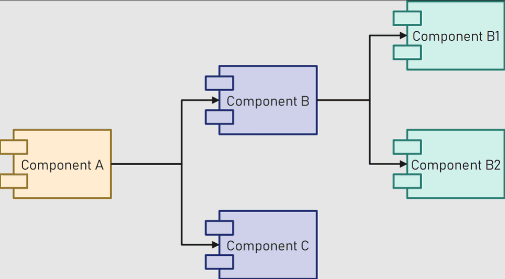
In the architecture of the Activator ecosystem, components play a central role as fundamental elements. As mentioned earlier, these components are reusable modular building blocks that allow for the creation and customization of dynamic web applications according to needs. While each component serves its function, they seamlessly integrate with each other to form a coherent and functional ecosystem. It is worth noting that in Activator Admin, components are classified into several types based on different creation methods. Some components are defined using data formats such as JSON or XML, while others are implemented using programming languages such as JavaScript or C#. Additionally, some components focus more on graphical interactions, such as reports, providing a variety of choices for users during design. This diversity of creation methods allows for maximum flexibility and adaptability in component development and management within Activator Admin. As for Activator Client, it represents the execution and illustration aspect in this architecture. It provides an environment where components designed in Activator Admin come to life. Through web services, such as websites, mobile applications, and more, components can be integrated and utilized. Thus, Activator Client becomes the visual point of access for the functionalities and services offered by the components.
Components in the Activator ecosystem are accessible and function through well-designed APIs. These APIs provide a standardized interface that allows users to interact with the components consistently and simplistically. When a user wants to use a specific component in their application or system, they can call the corresponding API to access the functionalities and data of the component. Similarly, if a user wants to customize a component or apply specific settings to it, they can do so using the provided configuration APIs. In summary, Activator components are accessible in an efficient and personalized manner, while fully leveraging their potential in applications and systems through APIs.
To access this platform(Activator Admin), you must first have a user account associated with an Activator tenant (client). If you do not have an account, please contact the tenant administrator to create one for you.
Open https://v2_admin_dev.asmlogic.com, you will be redirected to the login page (if you are not authenticated yet).
✋Caution
You can try this documentation with any environment, but it is recommended to use the dev environment. Check the full list of URLs for all environments here.
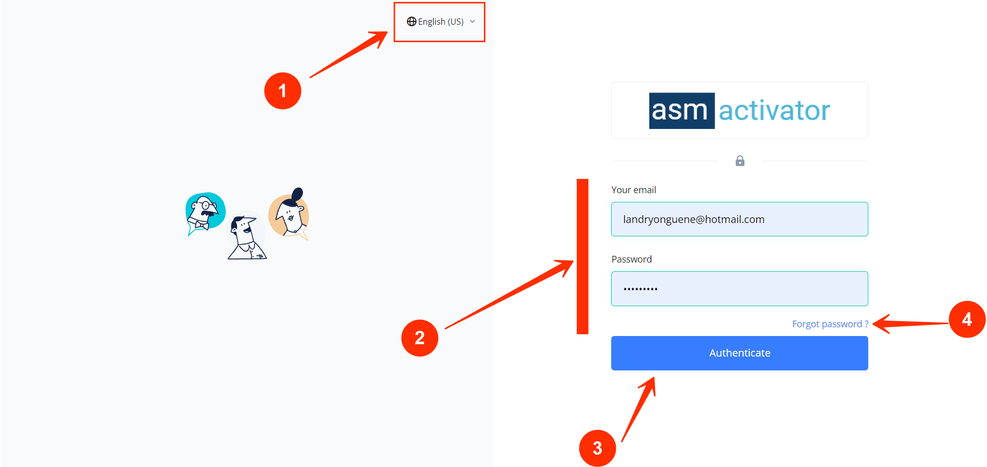
- Change Language Dropdown: Use this dropdown to select the display language. Currently, English and French are supported, with English as the default language.
- Login Form: This is where users input their credentials: email and password.
- Login Button: Click this button after entering your credentials (email and password) to log in to the system.
- Password Reset Button: Use this button if you have forgotten your password and need to reset it.
⛳Let's click on the login button and access the Activator homepage.
✍️NB
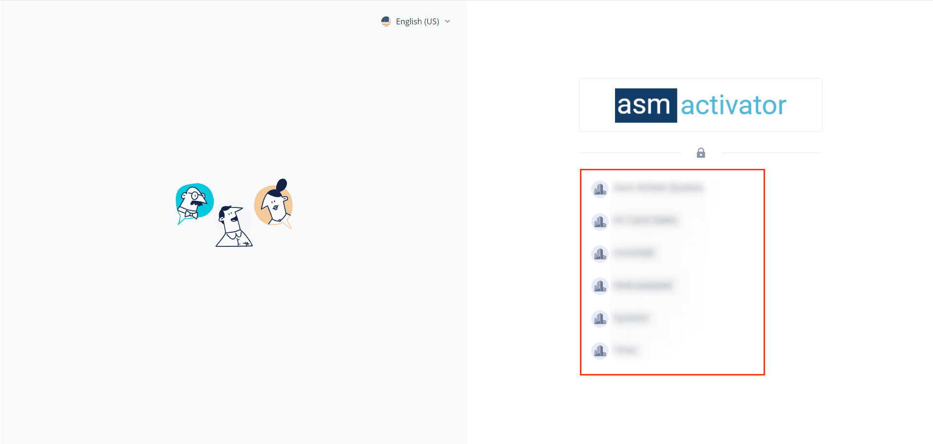
If you are associated with more than one tenant, you will see this page (image below) where you should choose the tenant you want to work with. Otherwise, if you are associated with only one tenant, Activator will redirect you directly to the home page.
Here is how the user interface looks on the Activator Admin home page (after selecting a tenant for those with more than one 😎)
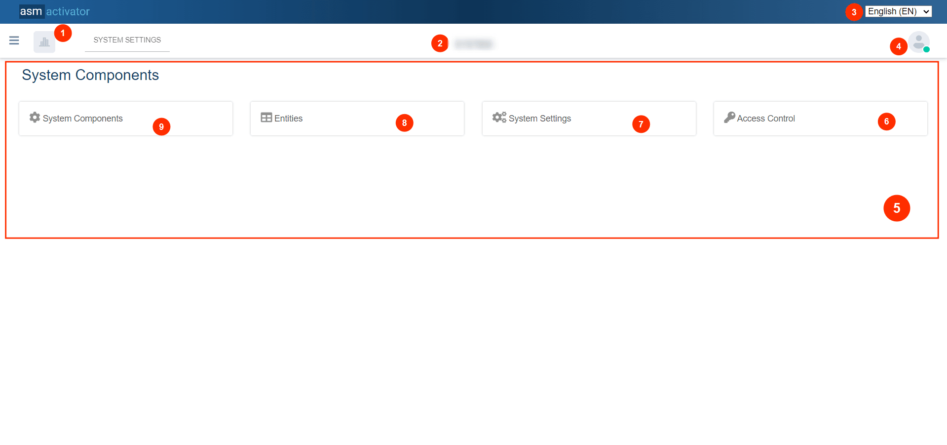
Tenant Logo: At this level, the logo of the tenant you are connected to is displayed.
💡Tip: If you are associated with multiple tenants, clicking on it will allow you to select and connect to another tenant. For more details, click here.
Tenant Name: At this level, the name of the tenant you are connected to is displayed.
💡Tip: If you are associated with multiple tenants, clicking on it will allow you to select and connect to another tenant. For more details, click here.
- Change Language Dropdown: Use this dropdown to select the display language. Currently, English and French are supported, with English as the default language.
- User profile picture: Clicking on it opens the user menu. For more details, go to [link: Manage My Account].
- The main container of the home page: It consists of four subsections, each representing the essential elements of the platform's operation, with specific features and objectives for each. They are distinguished in this way:
- Access Control: Enabling user and access permissions management while managing role assignments with the aim of working in regulatory compliance.
- System Settings: It is a component that allows configuring the essential elements of the system by adjusting the values of various parameters, including advanced configuration options for specific system functionalities.
- Entities: Allows defining the data type that components in the database can store or manipulate. Clicking on this link will take you to the management and configuration page for entities.
- System Components: This provides access to all other components of the platform, thus offering a wide range of features and possibilities to configure and optimize various aspects of the work environment.
👍 Now, let's delve into the details of the functionalities mentioned above.
Components Home Page
🖱️Note:
System Settings, Entities, and System Components all have the same graphical representation.
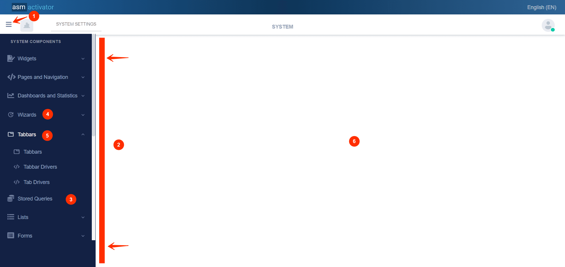
- Collapsible Menu: Is a user interface element that allows platform stakeholders to expand or collapse menu options according to their needs.
- Menu Container: This section adjusts based on the menu selected on the homepage, displaying different types of components according to this selection.
- Component Representation: This provides direct access to a type of component. Simply click on it to access the complete list of components created of this type.
- Unfolded Components Group: Represents a set of non-expanded components that share semantic similarities or are interdependent. This menu is collapsed when the small arrow on the right points downwards.
- Expanded Components Group: Represents a set of non-expanded components that share semantic similarities or are interdependent. This menu is expanded when the small arrow on the right points upwards
- Main Content: This is the area where both the list of components and their content will be displayed.
👍 Now, look at what happens when you click on a component.
It represents the action of the user clicking on the container of the component group, allowing the list of components to be displayed, thus providing the opportunity to interact with each one individually.
💡Tip: To clearly identify which component is currently active in the main content, observe the blue bar on the left to see which component in the menu it is positioned on.
👍 Subsequently, the first observation is to notice that the main content of the components described earlier in Section (6) has been modified after selecting a specific component to work on.
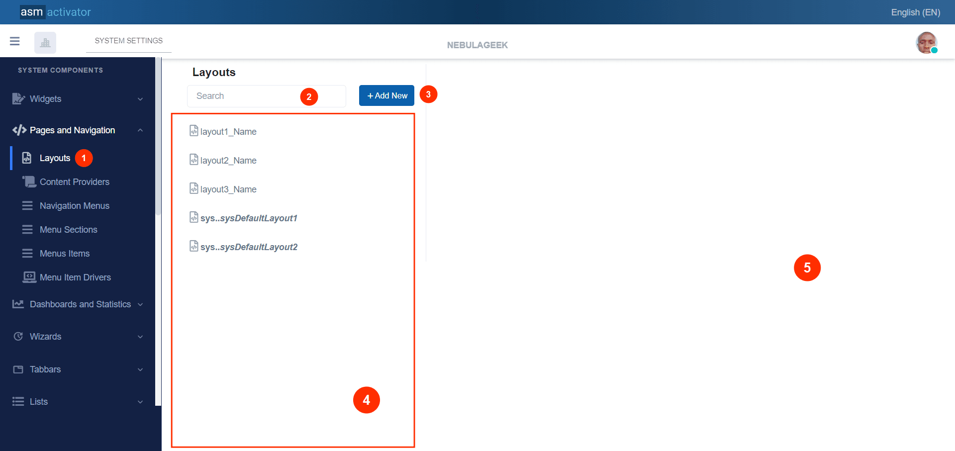
- Search bar allowing to find a component among the different components contained within the selected component type.
- New component: Button that allows creating a new component. Click here to see the process of creating a component.
- List of Components: This contains all the components that exist and are linked to this type of component.
✍️NB: We have two types of displays in the list of components.
- The normal display, for example,
layout1_Name, represents a component that has been created within the tenant.- The second display is in italic and bold, with the example on the image
sys...sysDefaultLayout1, which represents system components. This type of component is prefixed with the termsys, indicating that it is either provided in the tenant's license or belongs to a module configured within the tenant's license.
Click here to see how the details of each component are presented.
- Display Interface of Component Content
Creating A New Component
⚙ After clicking on button Add New, we observe:
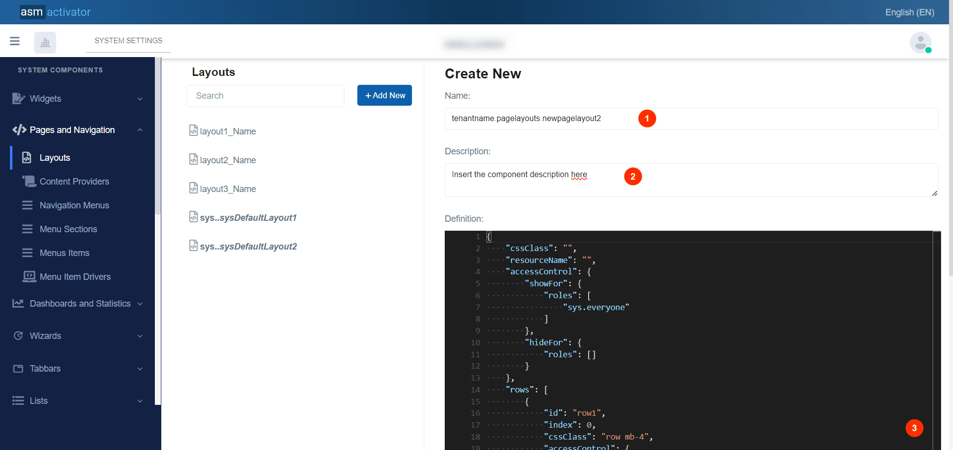
Observation: In what we are observing now in the content part of the component, we have 2 form fields containing respectively the name and description, and another field containing the definition.
- Name: The name follows a specific and predefined format which is divided into three parts, each separated by a period.
✍️NB: [tenantname.pagelayouts.newpagelayouts2].
- The first part: tenantname, It represents the unique identifier relative to the tenant schema, to wich the user is linked based on their role.
- The second part: pagelayouts It represents the component type that contains the component we want to create.
- The third part: newpagelayouts2 It represents the name of the component that the stakeholder can define themselves.
- The first and second parts cannot be modified, otherwise an error will occur, and so only the third part can be modified.
- Description: Here, we should provide information about the specificity of the component we want to create.
- Definition: Refers to how this component is described and structured. It varies depending on the type of component we want to create, where additional information may be added.
Component Details
👍 This is the representation you will see when you click on a component from the list of components introduced earlier here.
👍 Now we observe a change in the component content interface.
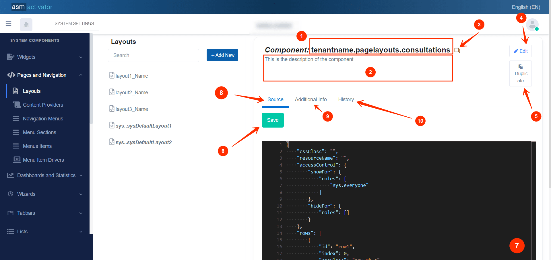
- Component Name
- Description of the component provided during its creation.
- functionality allowing to copy the component's name.
- The feature allows editing the name and description of the component Feature allowing editing on the description of the component name only. Understand editing by clicking here.
- Feature allowing to duplicate the component. Duplication avoids not only performing the same creation task for an existing component but also having the same component with identical values.
- Feature allowing to save the modifications made to the content of the component.
- The content of the component
- Source Tab: Represents the interface with the main details about the component's content.
- Additional info Tab: Additional component information refers to all the extra data or details associated with this component. View the additional info tab here.
- History: Tab allowing to display the history of modifications made to the component. View the tab for history here.
Editing The Name And Description Of The Component
👍 After clicking on the Edit Button (4), the edit modal appears with pre-filled Name* and Description* fields containing the text elements we want to modify.
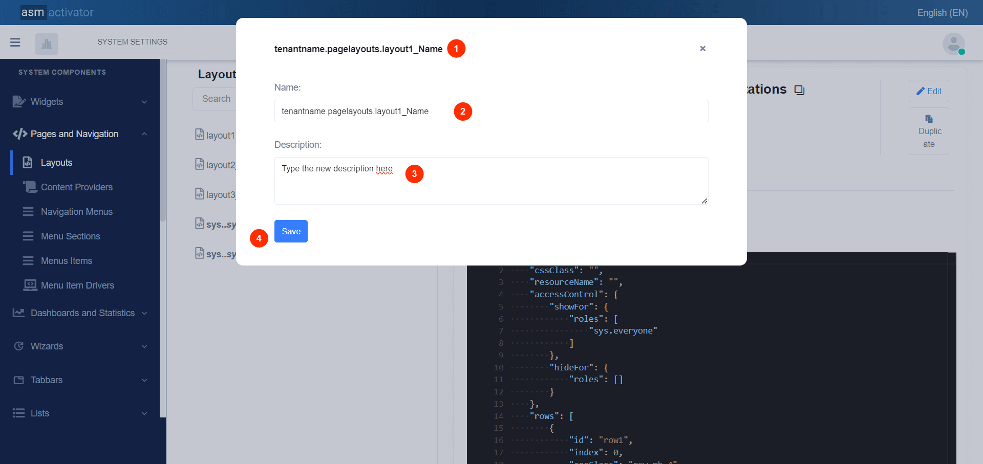
- Corresponds to the component name at the time of clicking the edit button.
- Form field for the Name section.
✋Caution
Only the third part of the component name can be modified (
layout1_Name).
- Form field for the Description. Here, the user has complete freedom to modify any text content during editing.
- Save Changes button that the stakeholder made.
Duplicating A Component
⚙ After clicking on button Duplicate
👍We observe the appearance of a modal that prompts us to confirm or cancel the duplication.
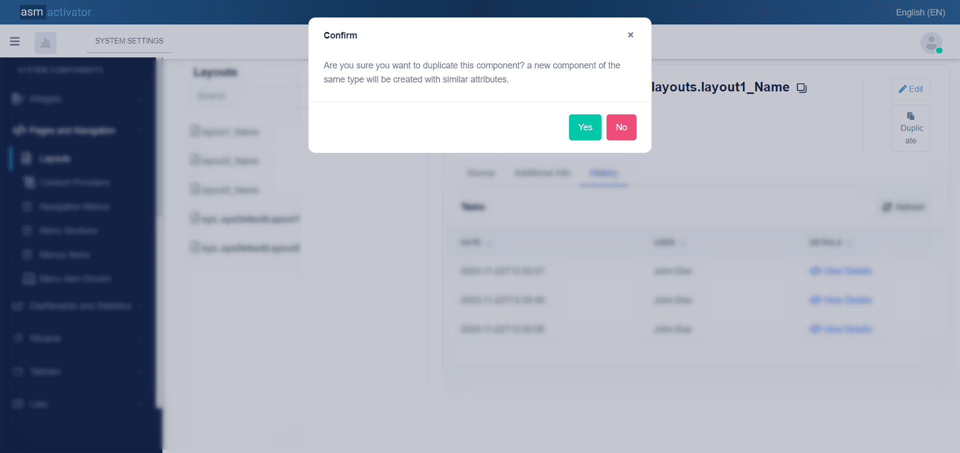
👍 After confirming the duplication, the system will proceed to create the same component but with the specificity of incrementing the duplication count of the component's name by 1. For example, for a component named tenantname.pagelayout.myFirstLayout, its duplication would be tenantname.pagelayout.myFirstLayout1.
Additional Info Tab
⚙ After clicking on Additional info
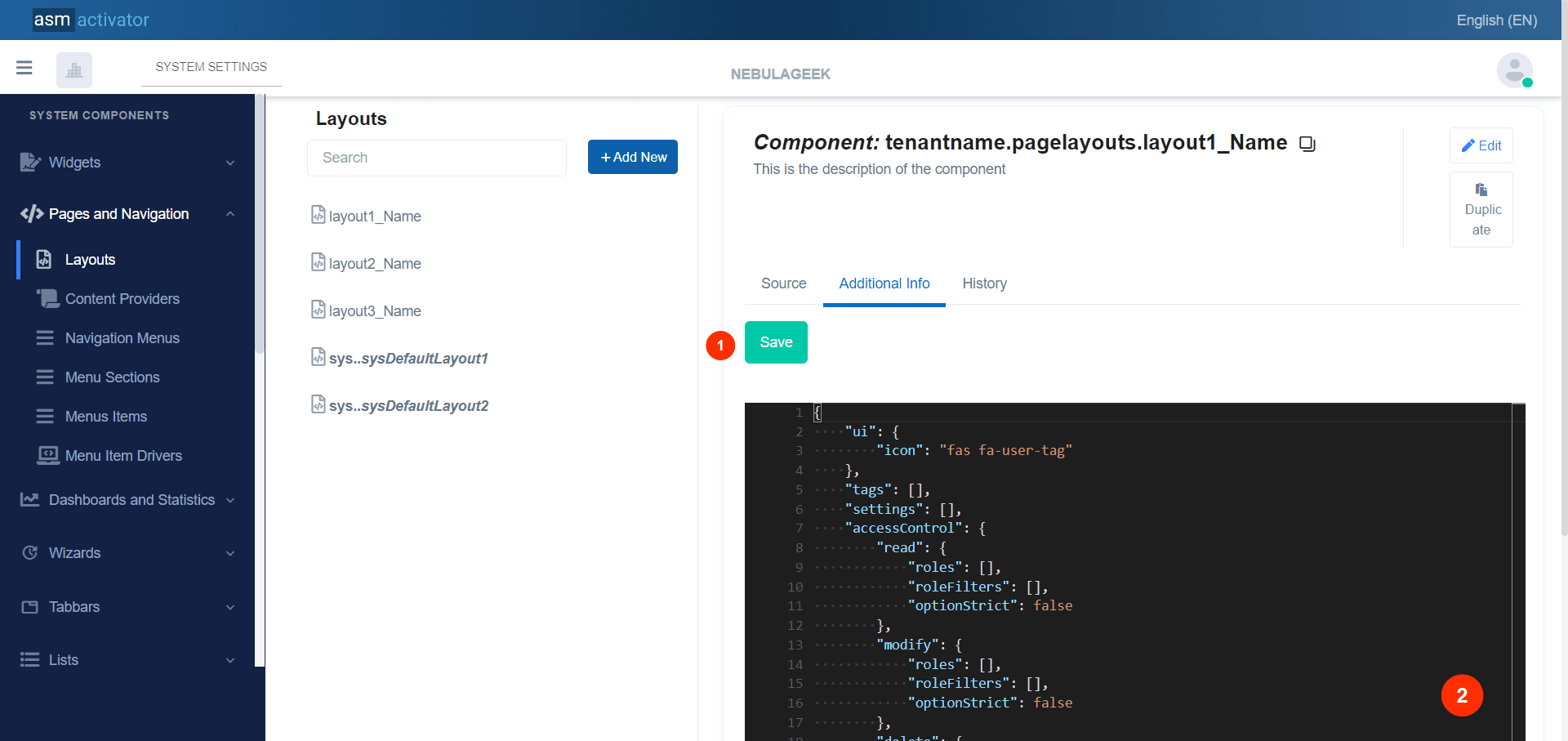
- Button for saving the content provided to the additional content.
- Content of the additional information. This content varies depending on the type of component.
History Tab
⚙ After clicking on #History:
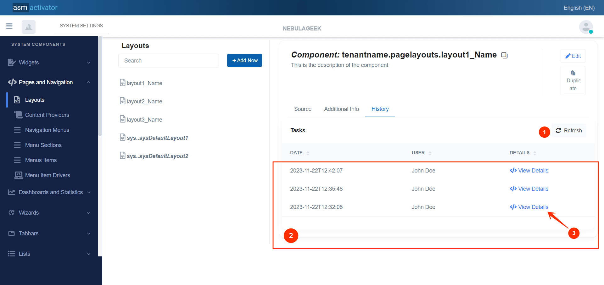
- Button used to refresh the list of modification history.
- This represents the list of various changes that have been made to the component. Each item in the list contains the date of modification, the user who made the modification, and a button to view the content of the modification.
- Button that allows viewing the content of the modification that was made.
Now, how can one view the content of a modification?
After clicking on element (</> View Details), a modal appears with elements related to the modification.
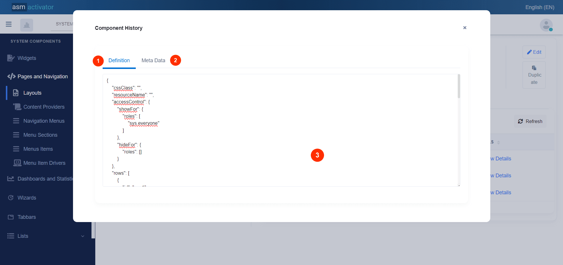
- Definition: representing the main content of the component.
- Meta data: Meta Data of a component refers to additional information that provides contextual details about the component.
- The main content displays modification details based on the selected tab.
Change Menu
To change the main menu, simply click on the SYSTEM SETTINGS button, as shown in the image below:
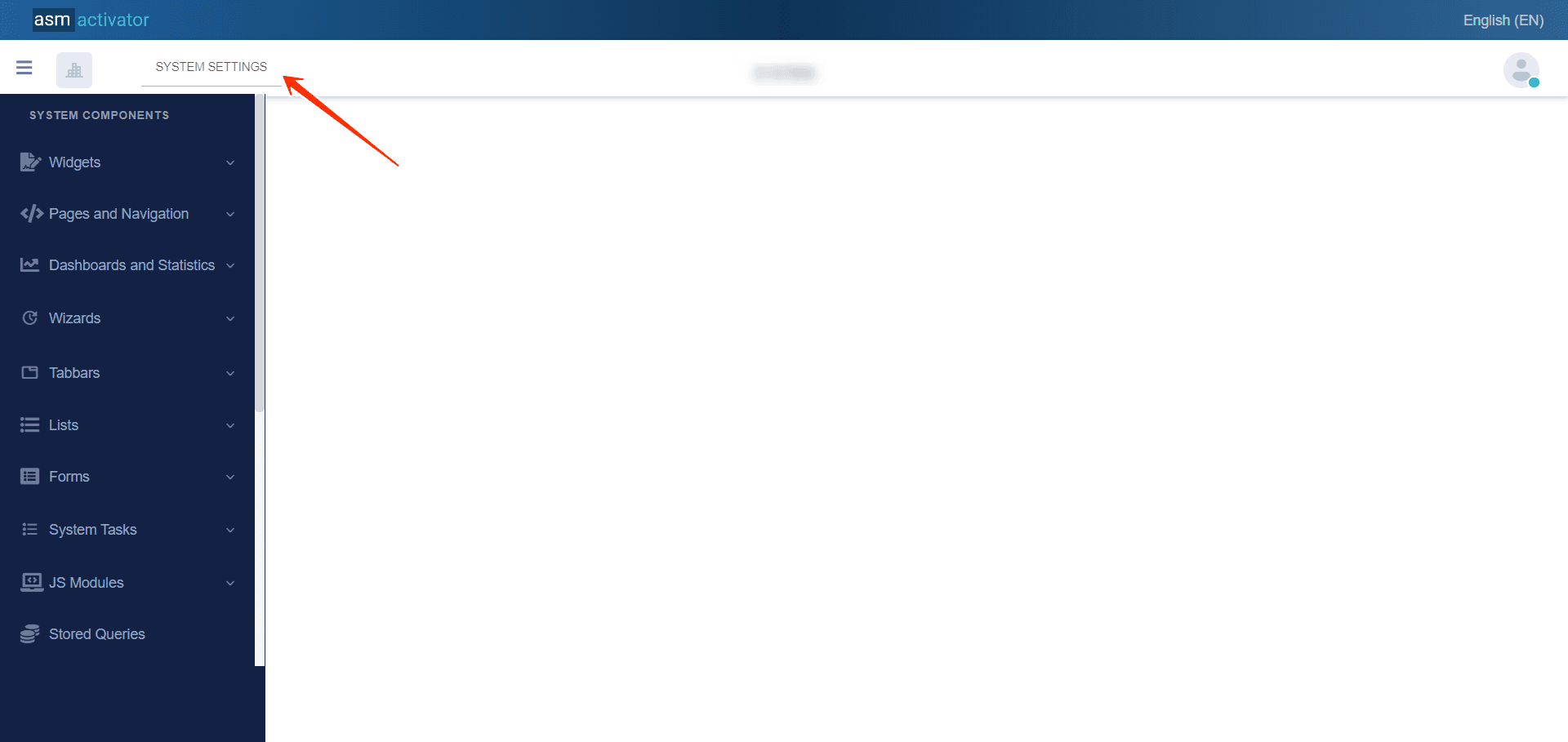
After clicking on SYSTEM SETTINGS, you have the option to choose from the various modules displayed, as shown in the main menu right here 👇:
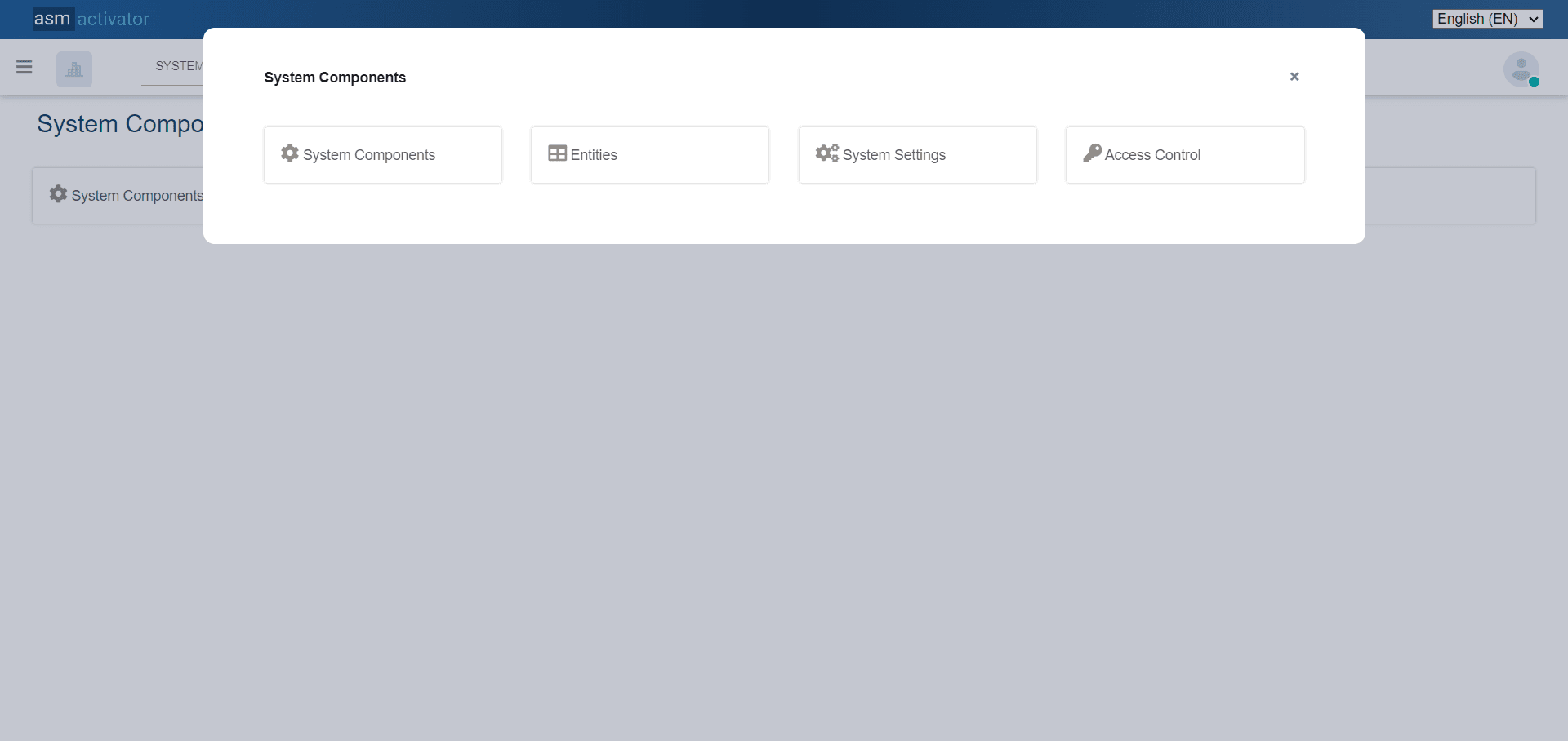
This menu (Activator Admin Main menu) refers to the interface where users can access features or different sections. This is where you typically find the four main modules (System Components, Entities, System Settings, Access Control) for operation and management in Activator.
Access Control
This page is observed when we have clicked on the Access control section of the main menu, shown just here.
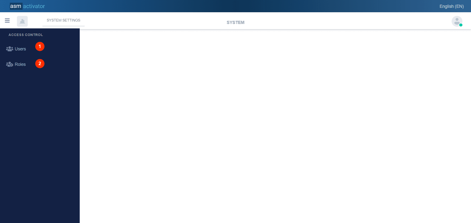
We can see 2 items in the sidebar menu:
- Users: It allows access to the #user manager.
- Roles: It allows access to the #role assignment manager for users.
Users Management
👍 When we click on Users(1), we can see now:
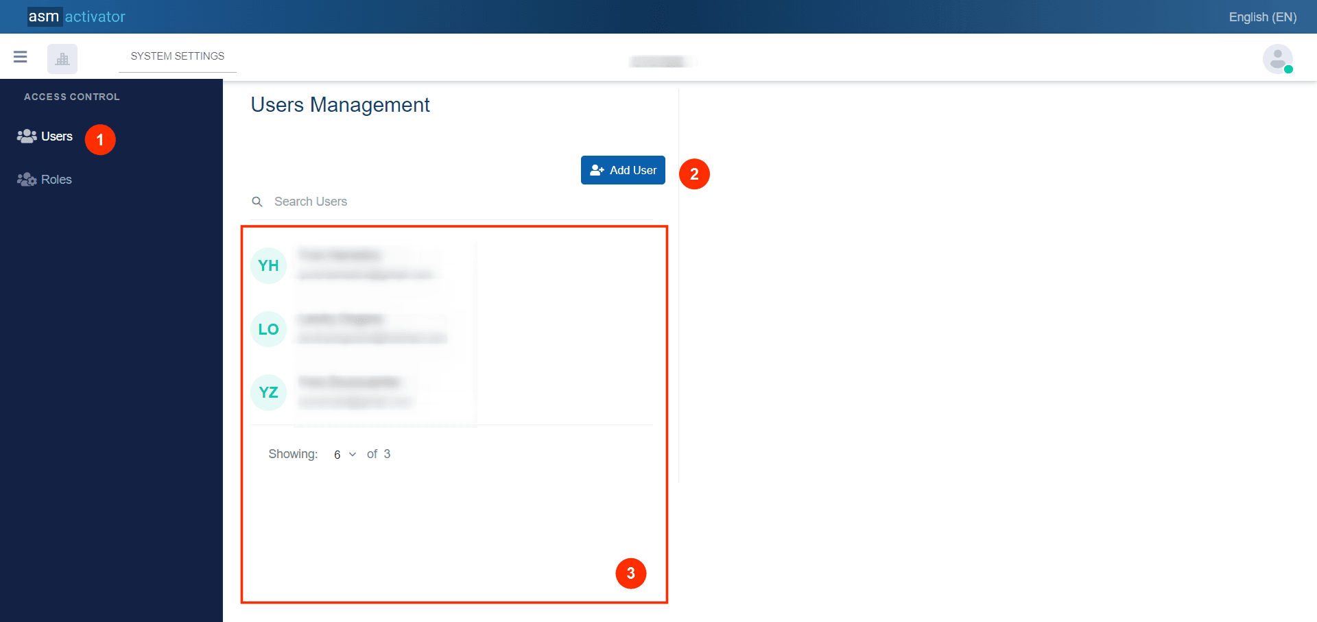
- This will allow us to access the user manager.
- Button to allow the creation of a new user.
- List of all users represented with their name and email address linked to the tenant.
👍 When you create a new user, they will be added to this section for you to view.
👍During browsing, you can delve deeper into user information by simply clicking on the user you wish to explore from the list of users, and view all the details of that account as illustrated in the image below.
👍Now, when clicking on the "Add User" button, a modal appears containing a two-step form to facilitate the user creation process.
User Creation First Step:
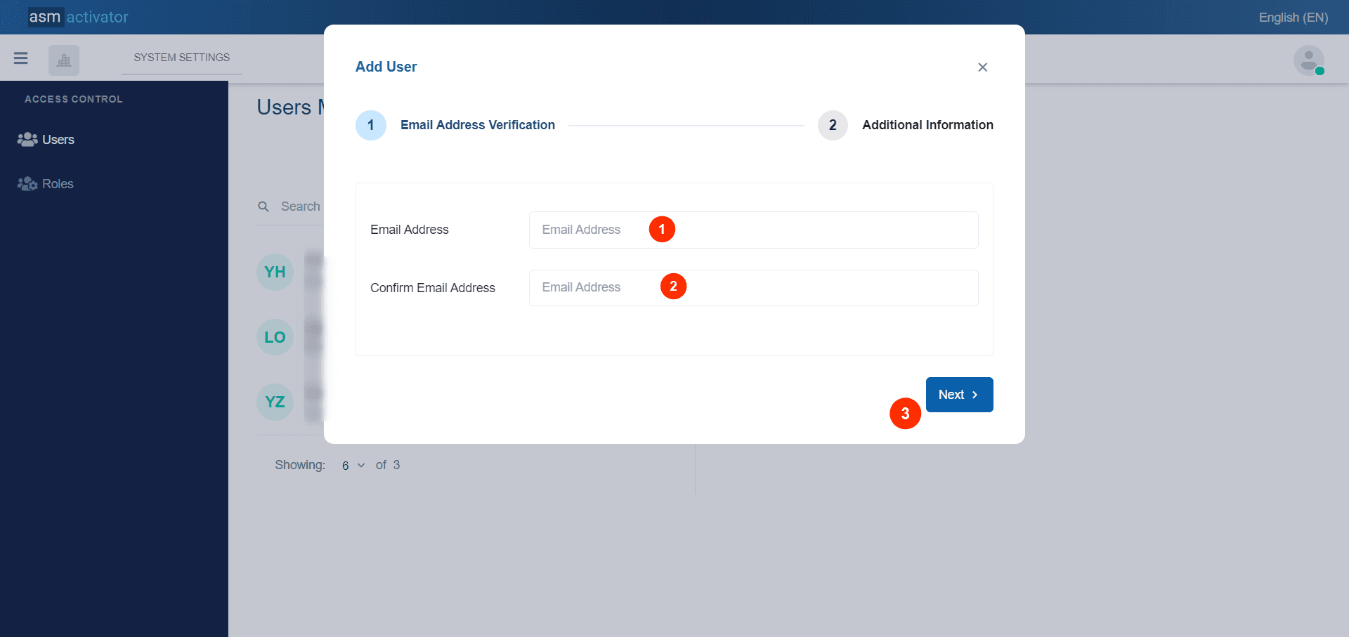
- Field to enter the email address of the new user
- Field to confirm the email address of the new user
✍️NB: It is essential that both fields contain the same email address.
Button to proceed to the second step of the user creation form
User Creation Second Step
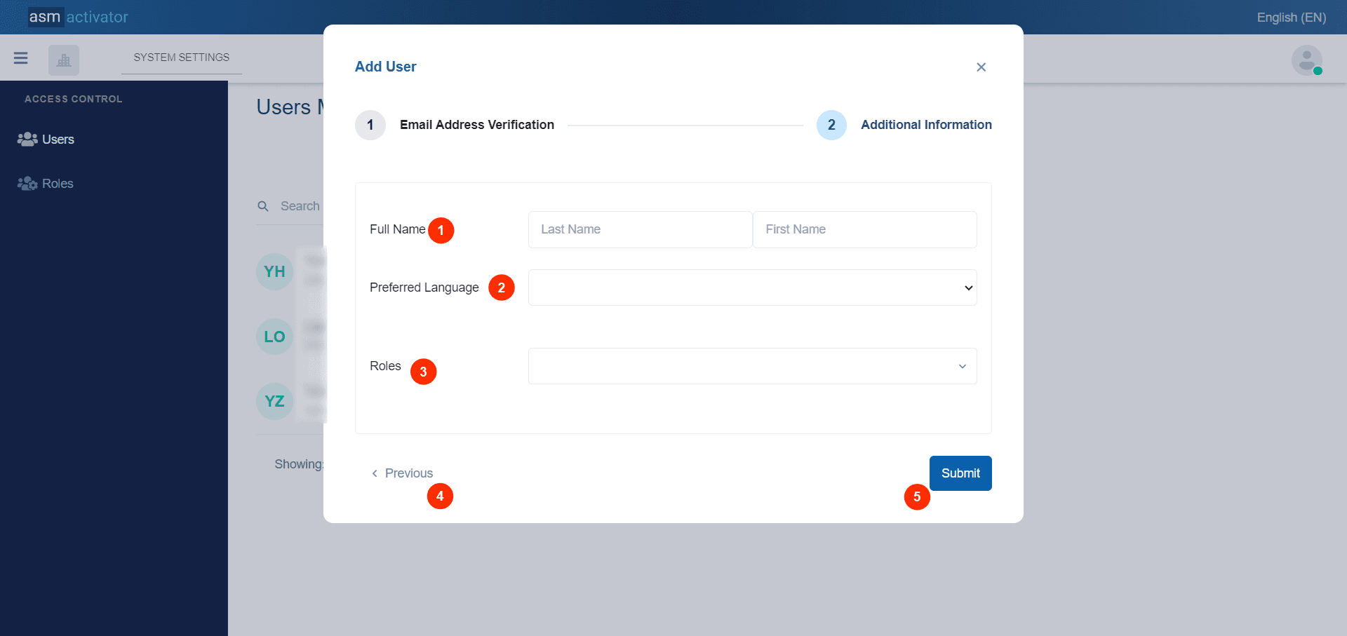
- Field to enter the first and last name.
- Select button to choose the preferred language. Currently, Activator only supports two languages: French and English.
- Select button that allows defining the Roles of the new user being created. Note: this field is not mandatory.
- Allows to return to step 1 (previous step where the user's email was entered).
- Confirm the creation of new user.
User Profile Details
👍 When you create a new user, they will be added to the users list section for you to view.
👍 During viewing, you have the option to display more detailed user data.
👍 During browsing, you can delve deeper into user information simply by clicking on the user you wish to explore from those listed in the user list.
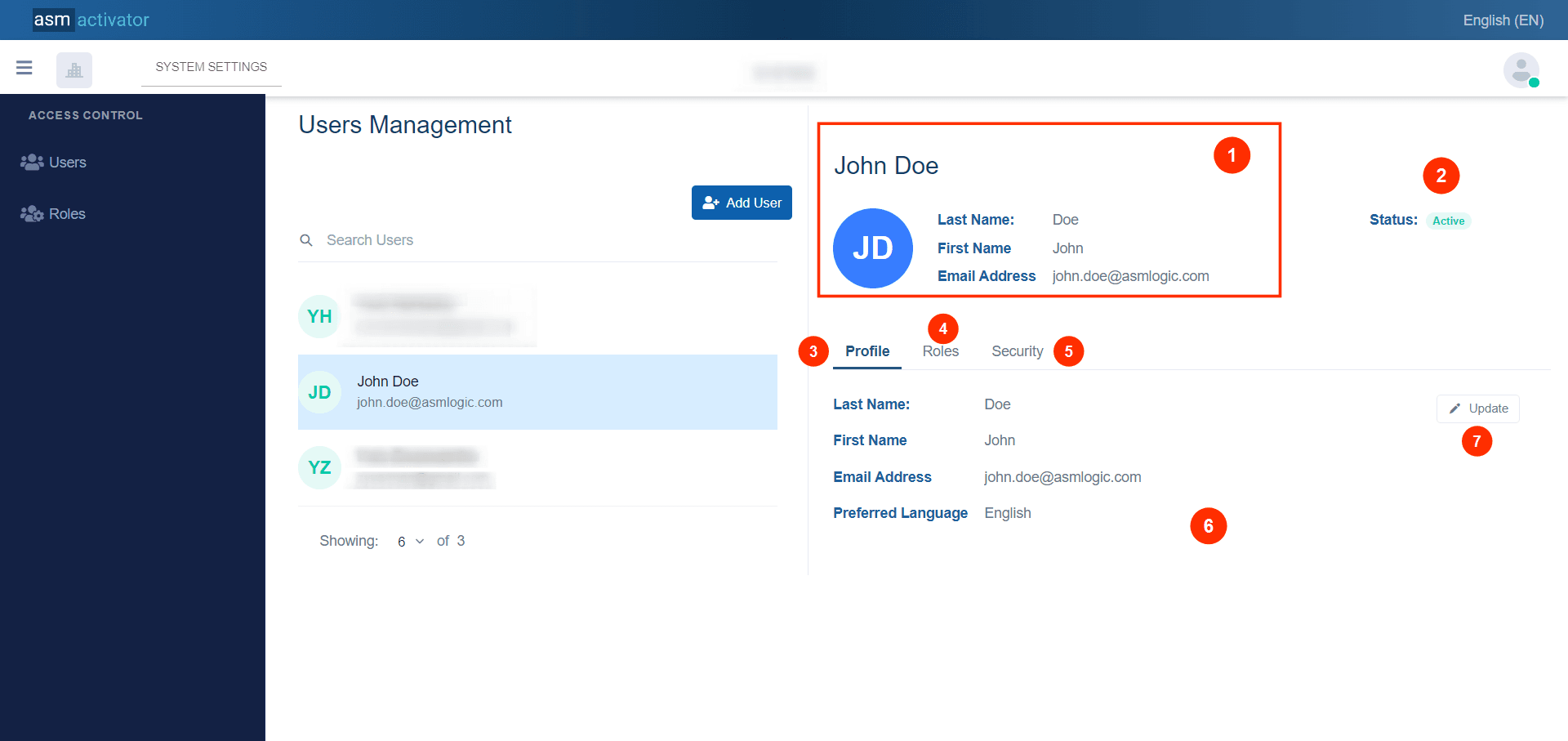
👍 With this action, you have on your right-hand side in the platform the details of the user's profile.
- We have the main information of the selected user, which includes the first name, last name, and email address.
- This indicates the user's status. This status takes two values: Active or Blocked.
- Profile Tab: That provides user information such as first name, last name, email address, and preferred language.
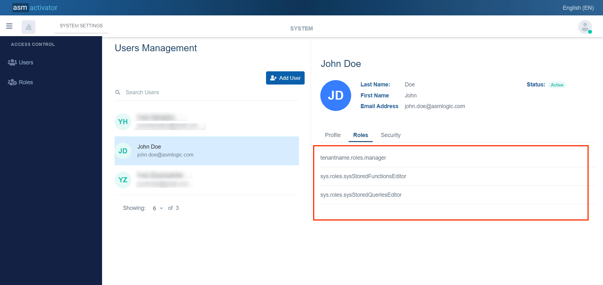
- Roles Tab : By clicking on this tab, we can see the list of roles assigned to this user for this tenant.
- Security Tab: It allows either to block a user's access to the system or to activate their access.
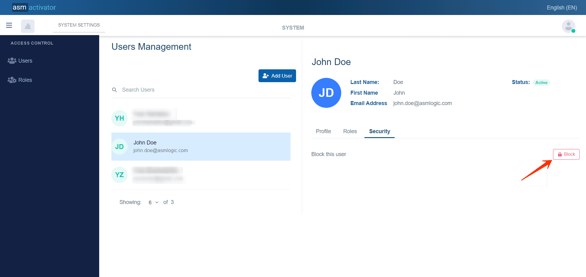
👍 When clicking, for example, on the " 🔐 Block" button to block the user, a confirmation popup appears asking you to confirm or cancel the initiated action.
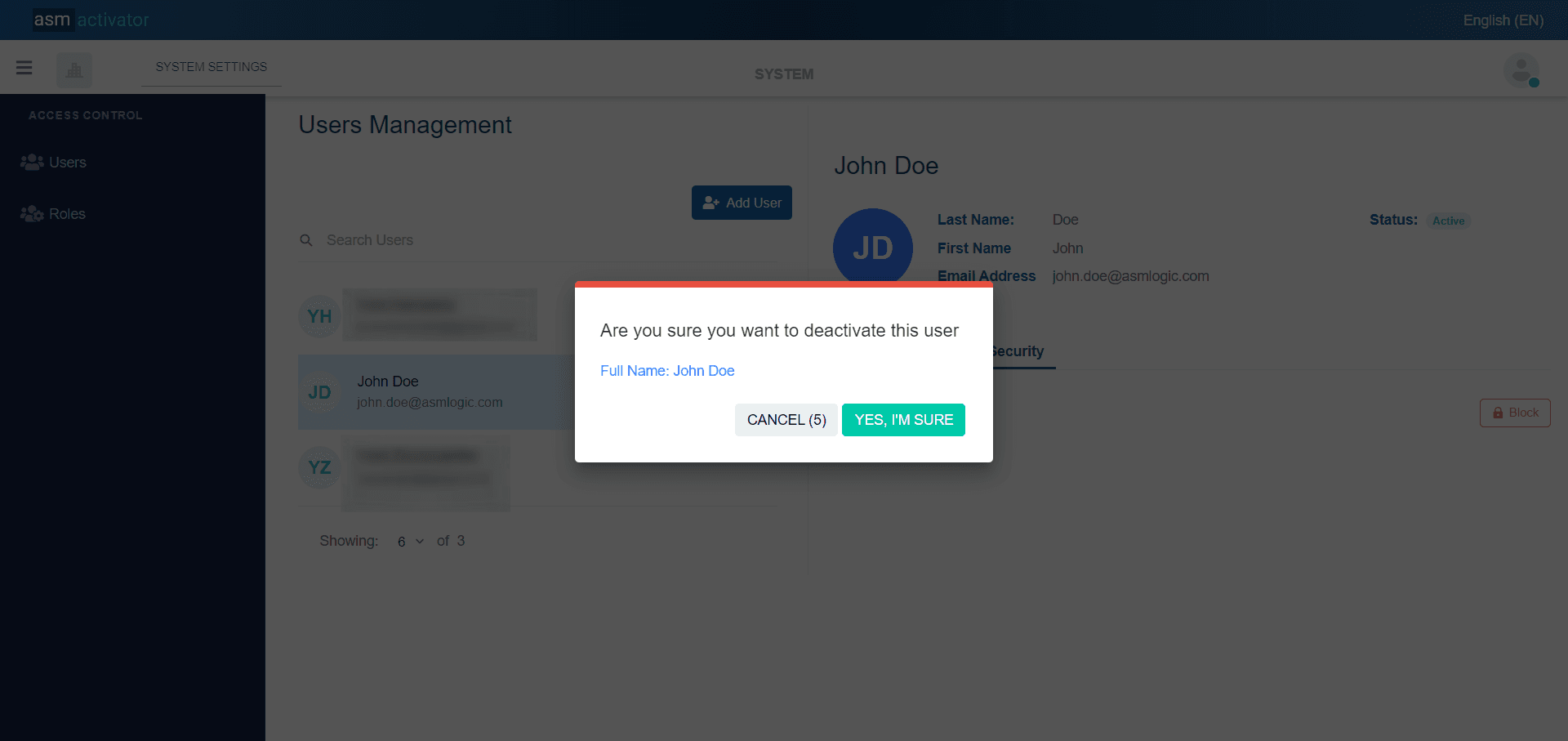
✍️Note:
You have a limited time to confirm the action, otherwise, it will be automatically canceled. Look at the “Cancel” button to notice the countdown of seconds.
- Contains the information elements for each tab.
- This button will allow modifications only to the user's profile information.
👍 When clicking this button, a modal appears containing a form with four fields, all pre-filled with the user's basic information, namely the first name, last name, email address, and preferred language.
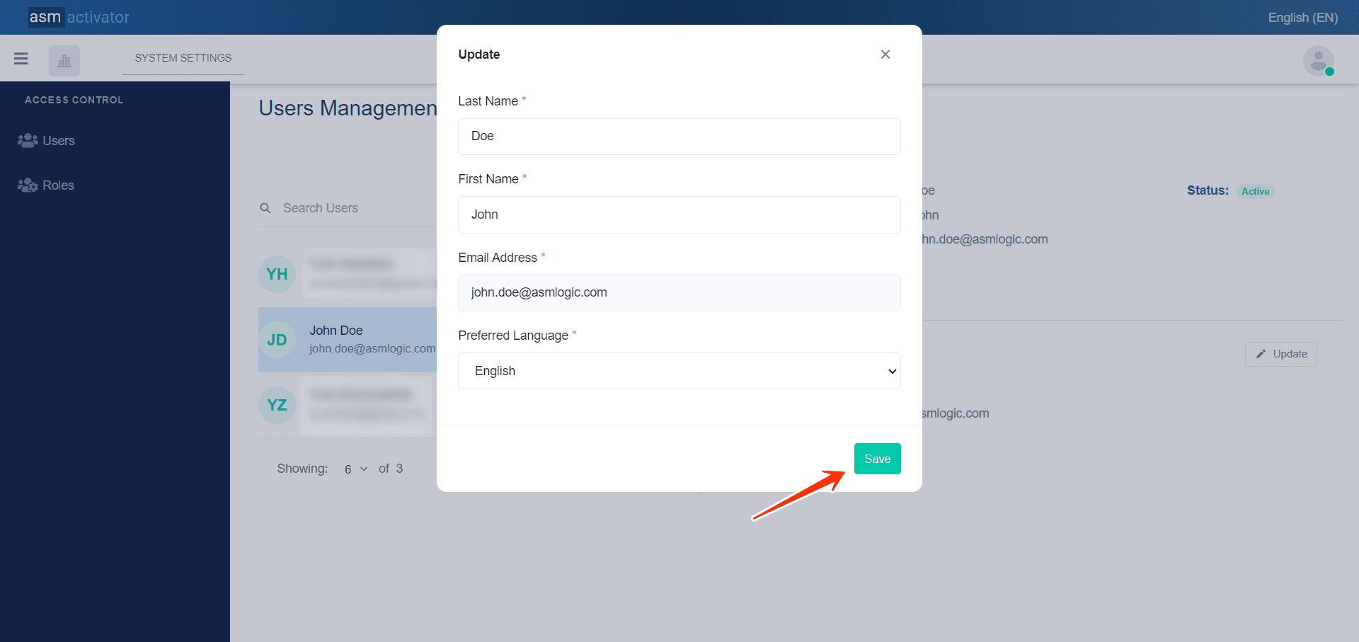
✋Caution :
No field should be empty when validating modifications by clicking the "save" button, and especially it is impossible to make modifications to the email address field.
Roles Assignment
👍 When we click on #Roles, we can see:
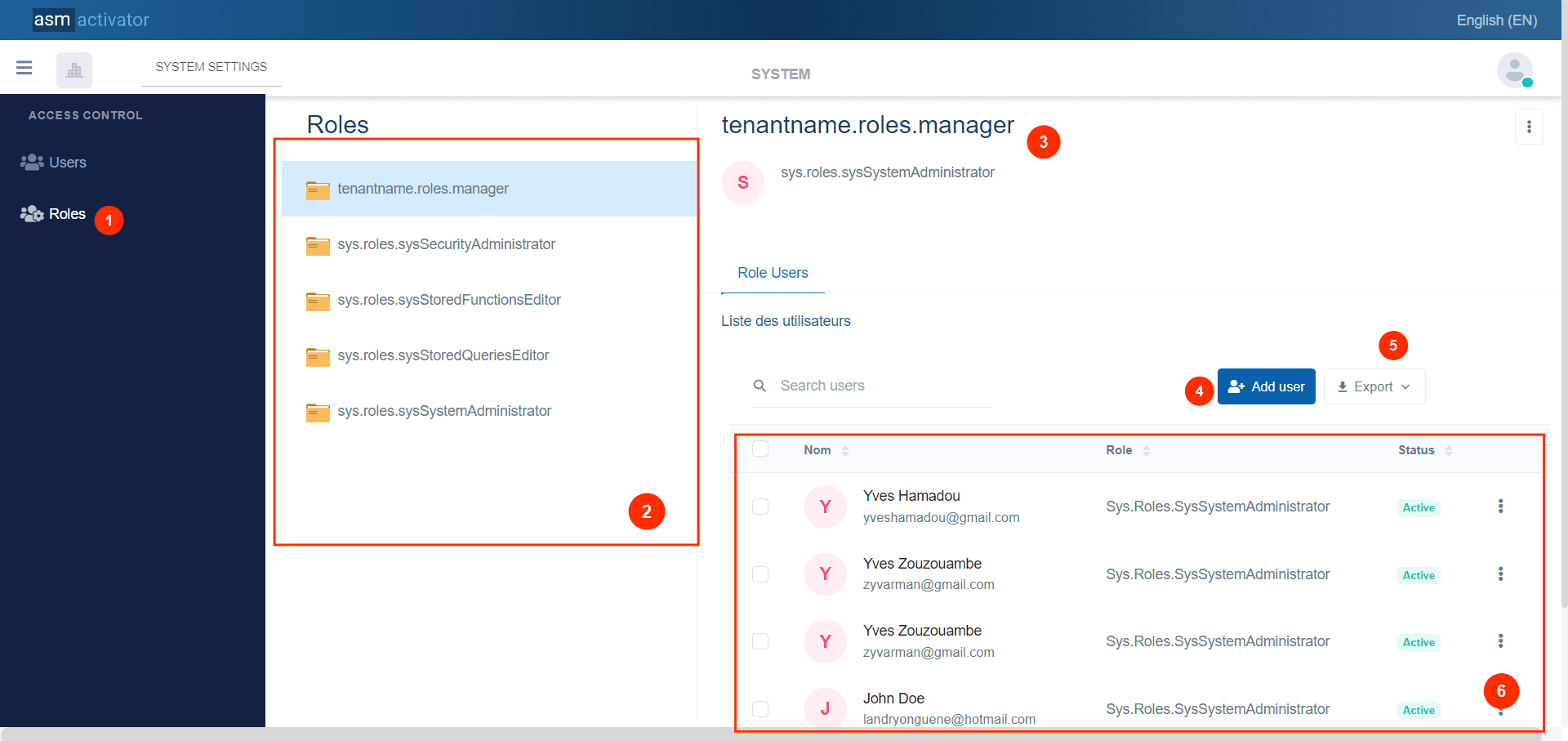
- Allows access to role-related information.
- List of roles available in the system, which includes two types of roles: system roles and roles created by the tenant.
✍️Note:
- System roles: within the list of roles are those with a name that starts with "sys.roles".
- Roles created by the tenant: System roles within the list of roles are those with a name that starts with the (unique identifier) “tenantname” of the tenant's name.
All these components are created within the roles component.
- Represents the name of the role.
- Button to allow adding a user in relation to the role selected from the list of roles (2). In other words, this action assigns this role to this user.
- Button to export the list of users associated with the selected role.
- List of users assigned to this role.
Adding a user(s) for a Role
👍 When you click the #add user button(4), a modal appears allowing you to perform this action.
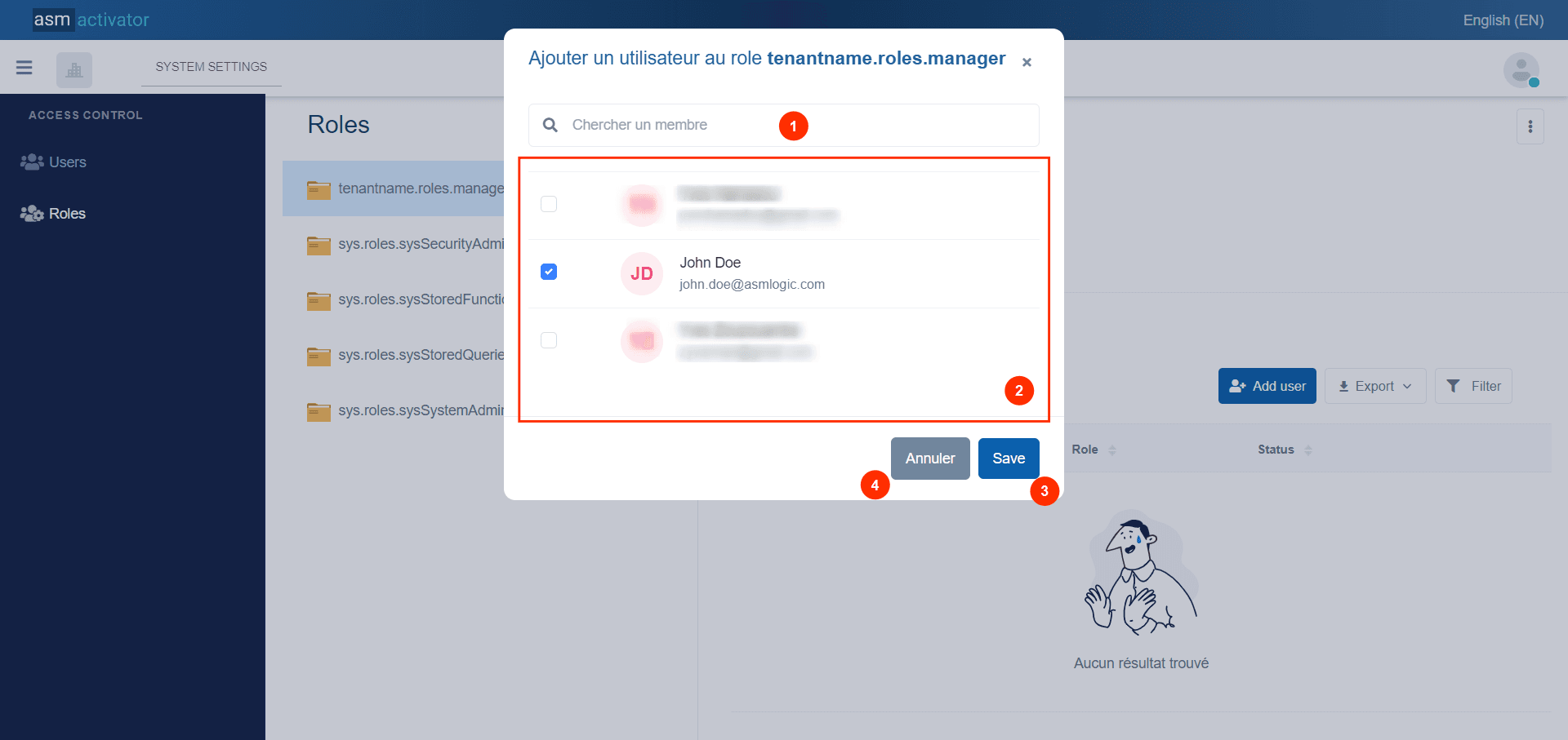
- Search bar to find a specific user.
- List of users to whom this role can be assigned.
💡Tip: For each selected user, notice that the checkbox to the left of the user's name will now be blue.
- Button to confirm adding users after selection.
- Button to cancel adding a user even if users has been selected.
Change Tenant
✋IMPORTANT
This feature is only available for users who are associated to more than one tenant on Activator.
By clicking on the tenant's name or logo, a popup will appear on the right side of the screen, as shown in the image below. This popup will display the list of tenants associated with your user account, allowing you to change the tenant's logo or select a new tenant with which you wish to reconnect, as illustrated in the image below.
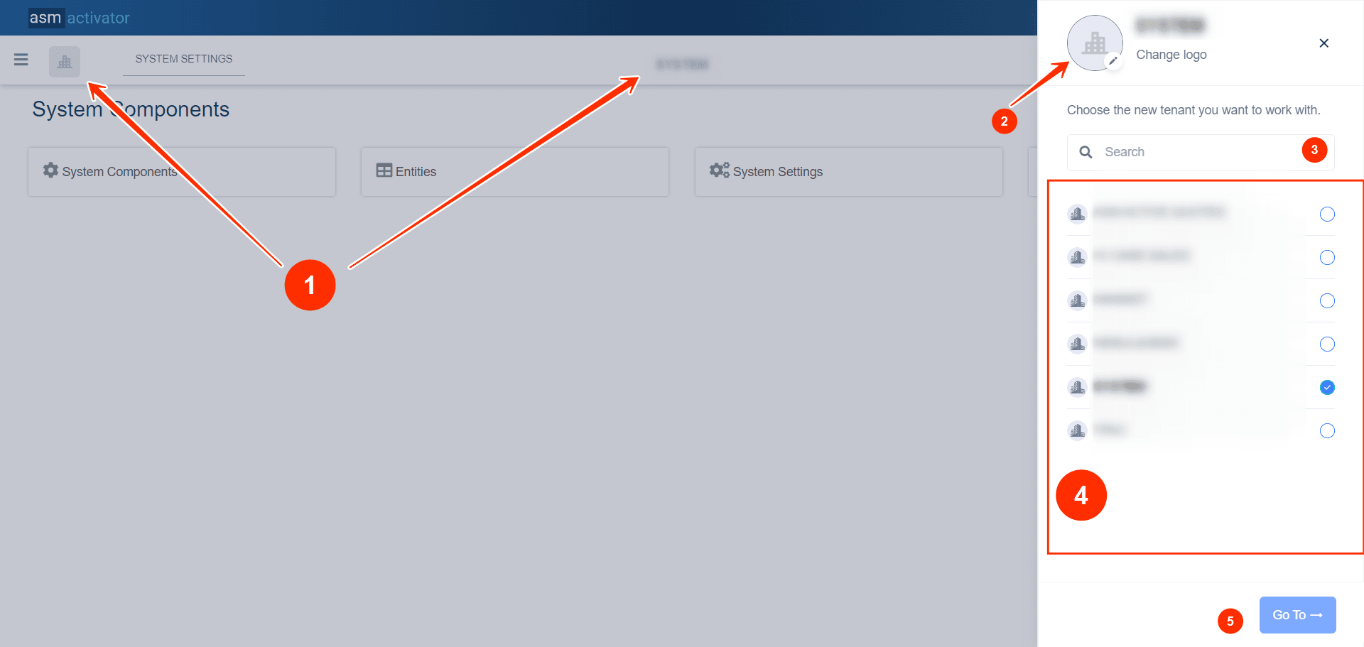
- Tenant Logo (on the left) and Tenant Name (on the right): Clicking on either of these opens the right-hand popup.
- Tenant Logo: It Allows to #change the tenant's logo.
- Search Engine: It filters the list of tenants based on the search term entered.
- List of Tenants: Displays the tenants associated with your user account.
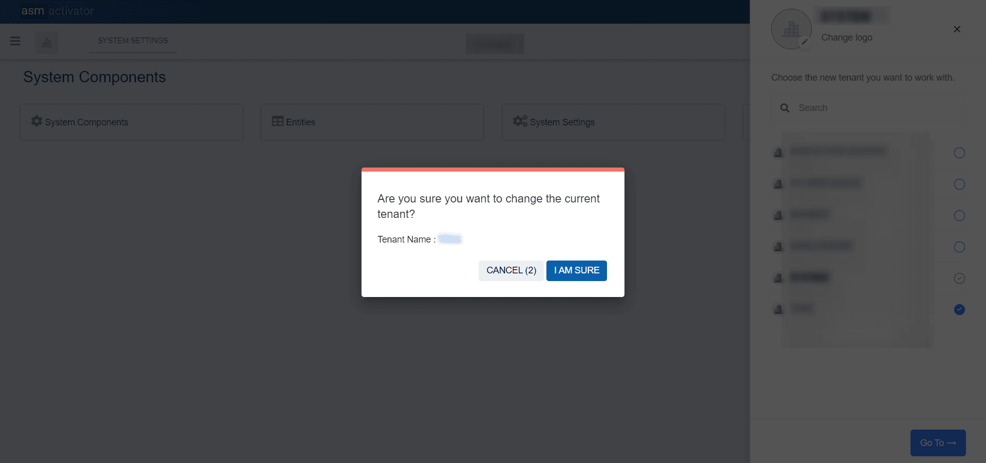
- Button to Change Tenant: Clicking this button prompts an alert asking you to confirm the tenant change, as illustrated in the image below.
Change The Tenant's Logo
⚙ When we click on the tenant image to edit it.
Here (the tenants list sidebar popup in the #image above), we can see our tenant's logo. To change your tenant's logo, simply click on the current logo (shown as 2 in the #image above). Once the image is selected, a popup will open allowing you to view your new tenant's logo.
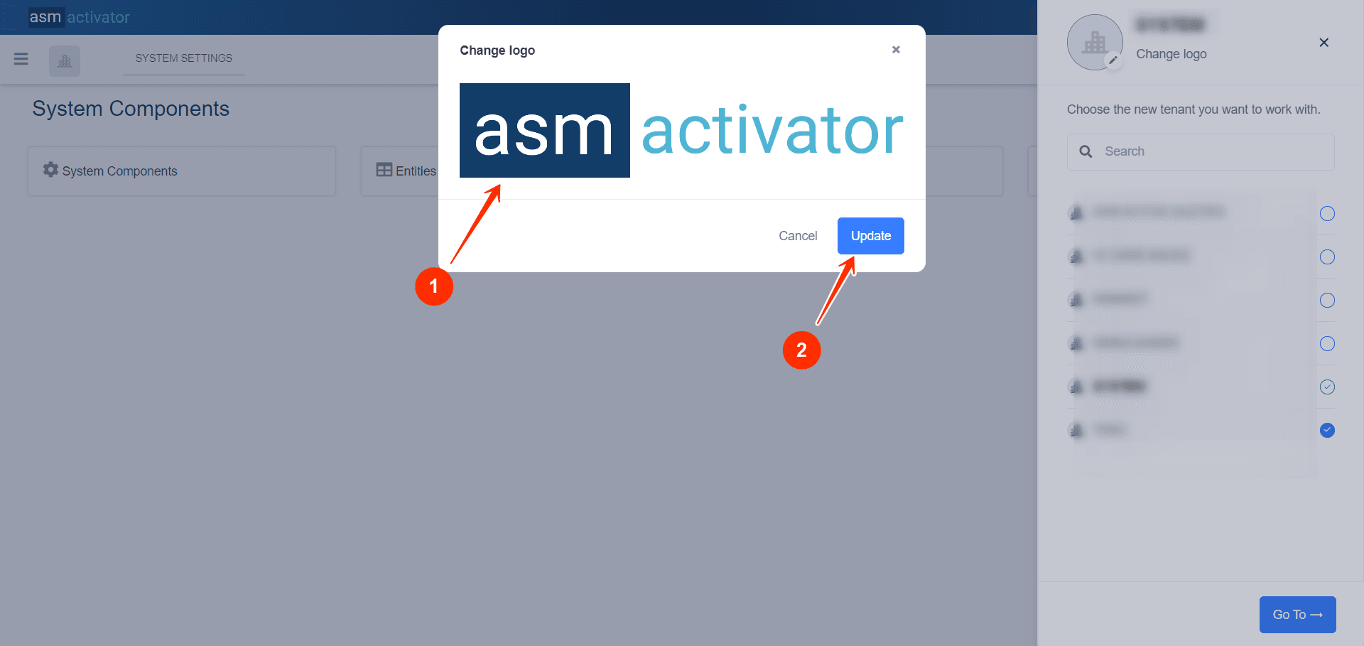
Selected logo from the tenant's device for updating its logo.
Upon clicking, it will allow saving the modification and previewing it.
User Menu
The user menu consolidates all the options and functionalities for the logged-in user to manage their account and access personal settings on the platform.
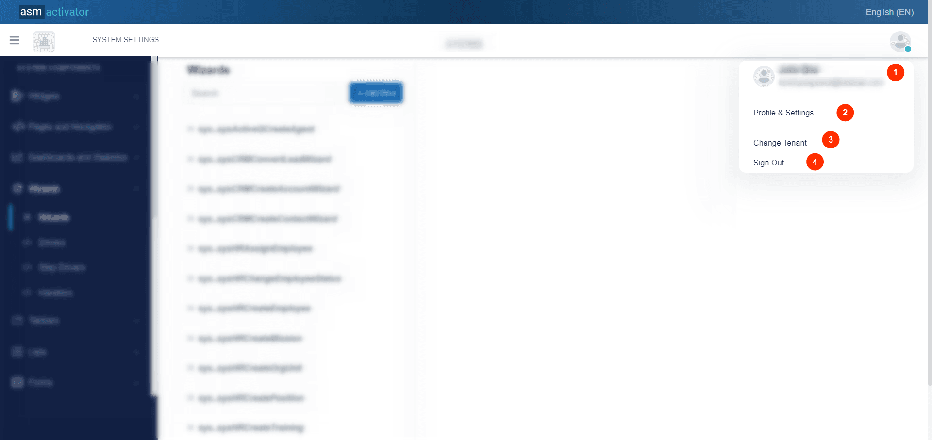
- Here, your full name (first name and last name) and email address associated with your account are displayed.
- Account Settings and Configuration: This section allows you to manage your account's primary information, change your password, and configure multi-factor authentication (MFA).
- This link allows changing tenants.
- This link allows you to log out.
Let's delve deeper by clicking on Account Settings and Configuration section, where you can manage your account's primary information, change your password, and configure multi-factor authentication (MFA).
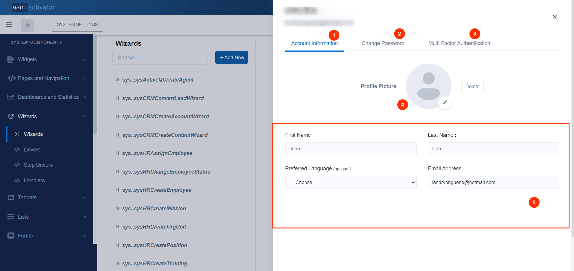
The account configuration popup is divided into three sections:
- Account Information🧾: Allows you to view and modify basic information such as your name, email address, etc. You can also change your profile picture here.
- Change Password🔑: Allows you to modify your password for account security.
- Multi-Factor Authentication (MFA): Provides the option to configure an additional authentication method to enhance the security of your account.
Account Information
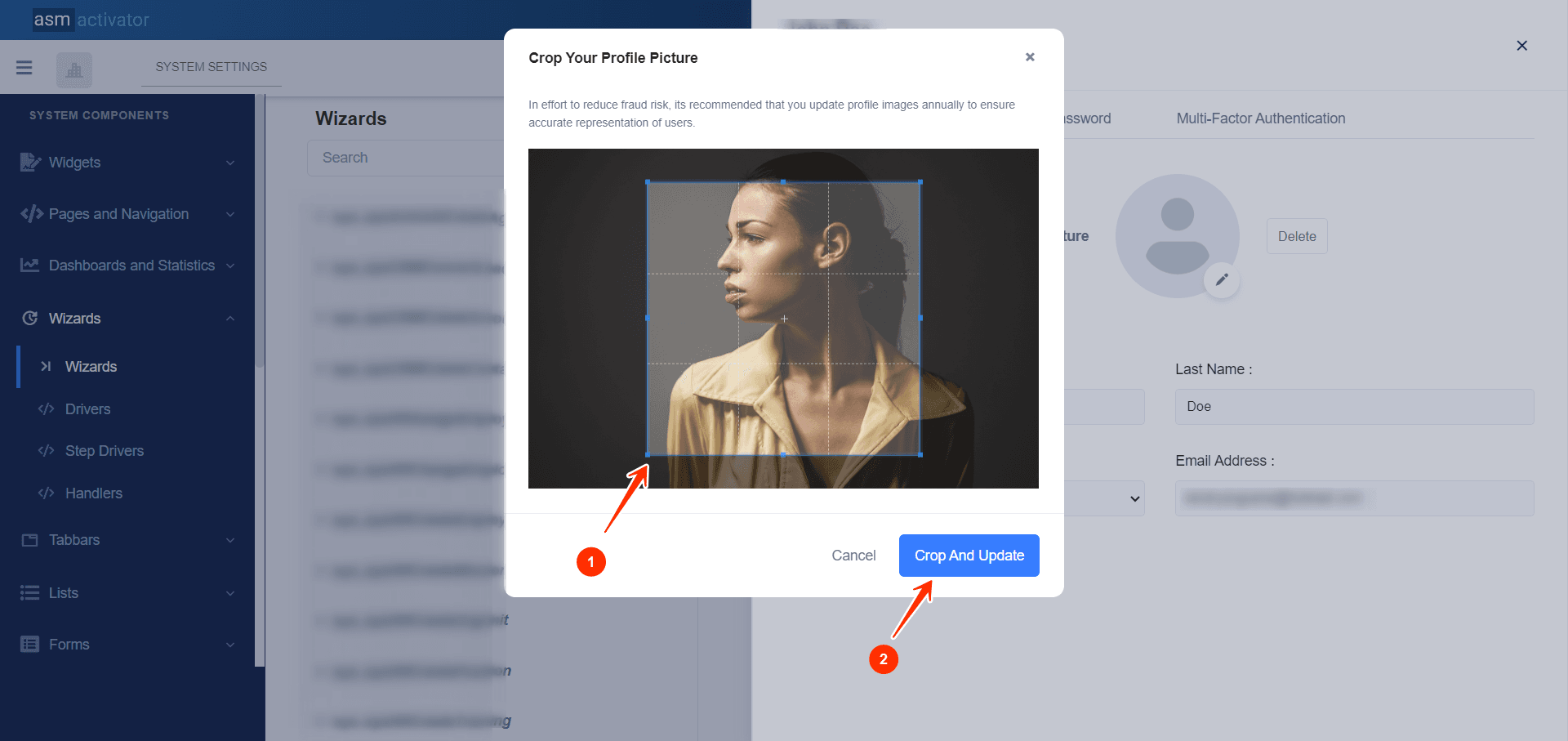
Here (the current tab in the image above), we can see the basic information of our account and change our profile picture. To change your profile picture, simply click on the avatar/your current profile picture (shown as 5 in the image above). Once the image is selected, a popup will open allowing you to view and crop your new profile picture👨💼.
Change Password
To change your password, go to the "Change Password" tab in your account settings popup. Enter your current password (for verification), then input your new password. Confirm the new password, then click "Update Password" to save the changes. Be sure to confirm your new password to complete the process.
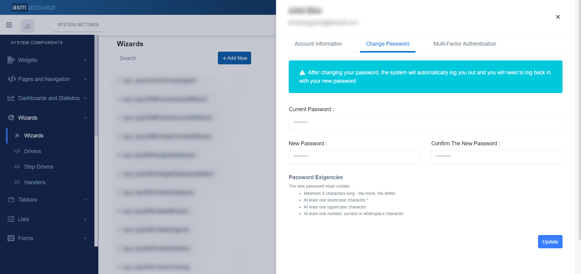
Password Exigencies🔑
The new password must contain:
- Minimum 8 characters long - the more, the better
- At least one lowercase character
- At least one uppercase character
- At least one number, symbol or whitespace character
Once you've completed this process, you'll be logged out and redirected to the login page, where you can log in using your new password.
Multi-Factor Authentication (MFA)

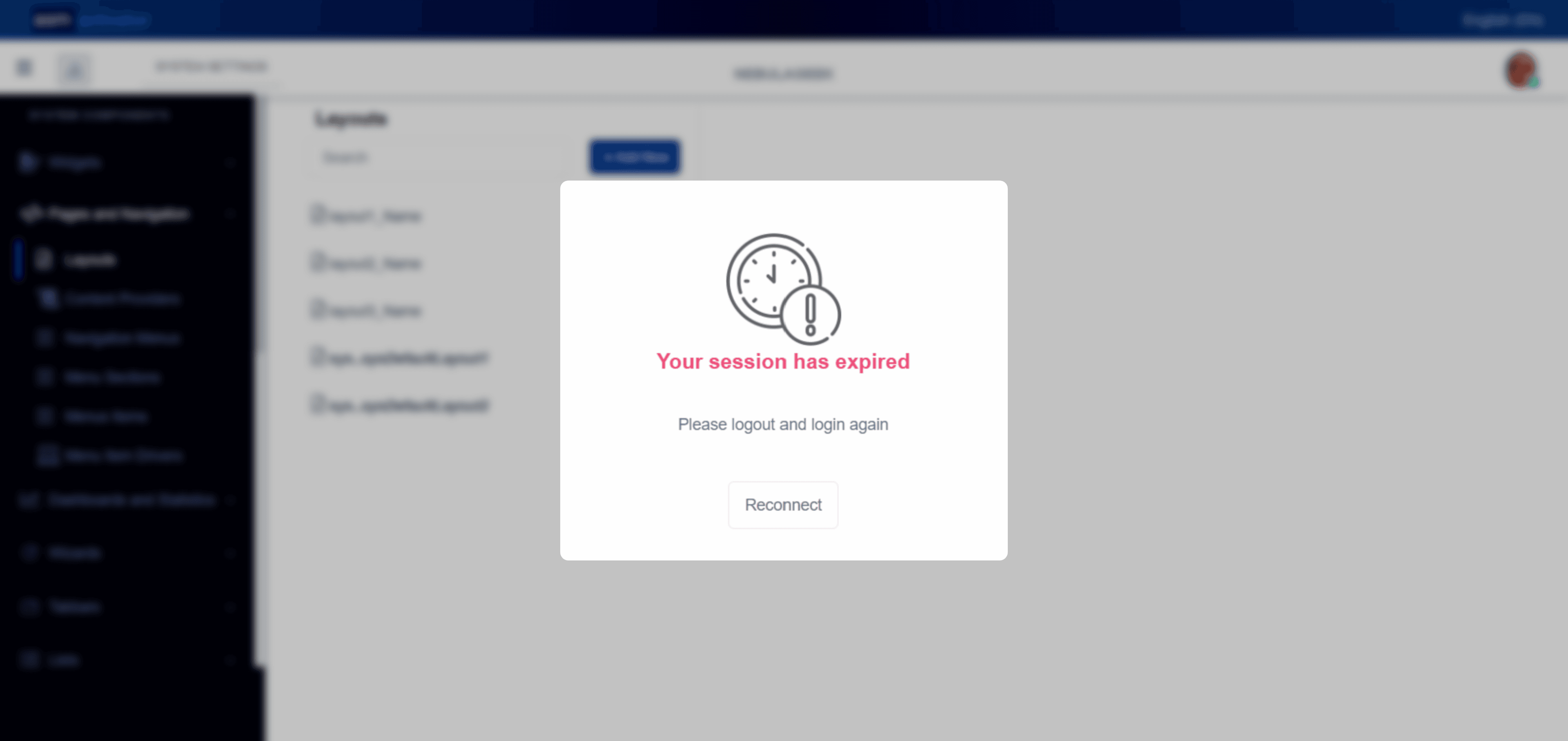
Session Expiration📴
On Activator Admin, the session is limited to a certain duration for security reasons. When your session expires, a popup will open asking you to reauthenticate. This ensures the protection of your data and ensures a secure use of the platform. You can see the illustration of this process in the image below.
Conclusion👨🎓
You've just uncovered Activator Admin, where you've now explored the fundamental tools for efficiently managing your platform.👏 Activator tool encompasses several other elements to ensure smooth operation, and to enhance your understanding and discover advanced options, you have the opportunity to continue your learning by exploring how API Services work and communicate, or by starting to work on setting up the Navigation menu.