Layouts


Intro

The Layout component allows structuring a container into a grid (similar to Bootstrap grids), where each customizable grid is managed by a Content Provider exclusively responsible for its content. Additionally, the Layout component manages the security of each grid, displaying information based on the user's privileges. This enables it to play a key role in the presentation and accessibility of various features.

Actvator Client Layout Component
Activator Client Layout Example

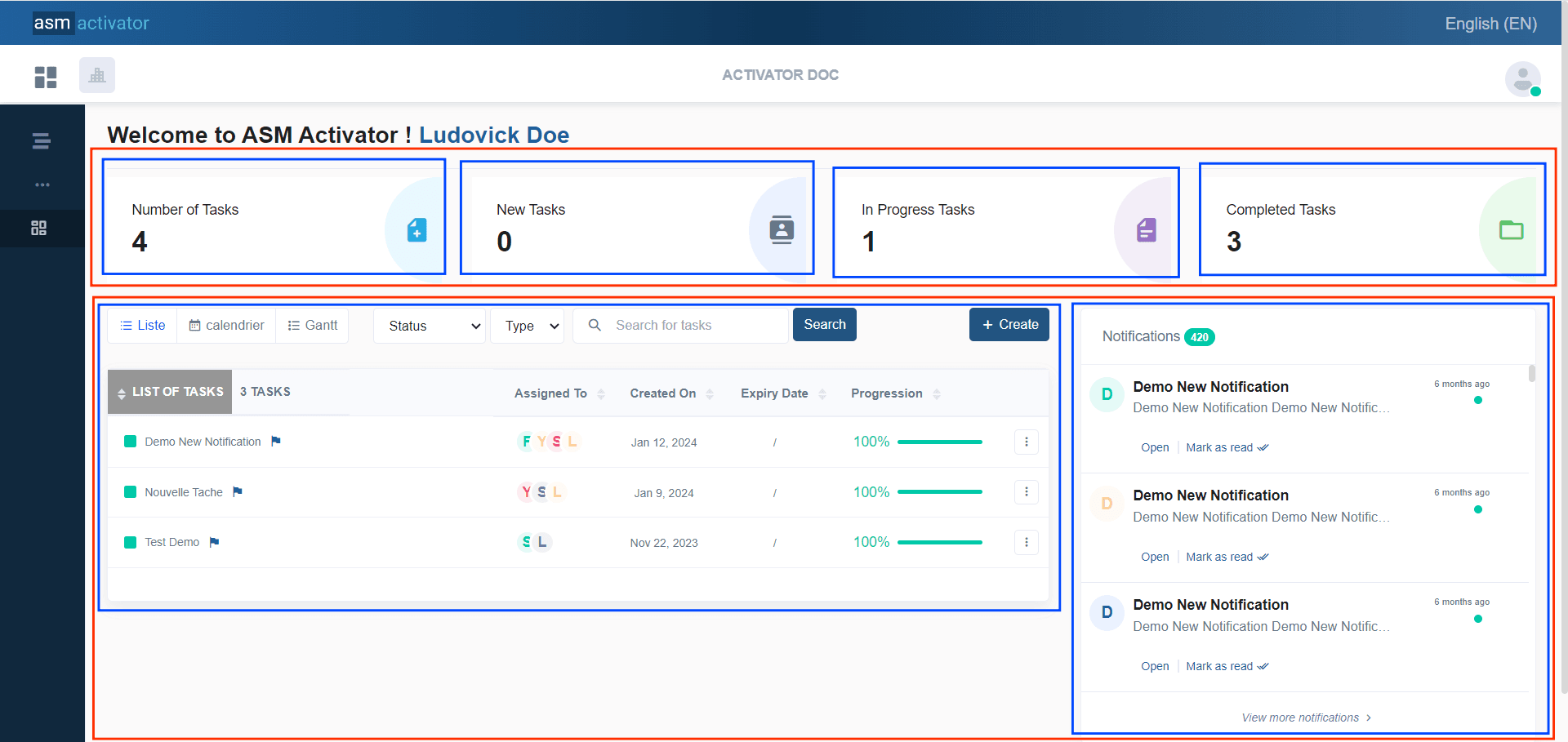
In the above diagram, for example, the layout has been implemented across the entire main container. We can see two sections highlighted in red🔴. These sections act as rows. Within each row, we can see the highlighted grids (in blue🔵) that act as columns.

Notice that every column is rendered and managed by its content providers.


Create A New Layout

In Activator Admin , the Layout component is located within the menu container, among the items listed under </>Pages and Navigation. As shown at (1) on the image below. 

✋CAUTION

Make sure you are in the System Component main module


Activator Admin - Create Layout
Activator - Layout Component Menu Item

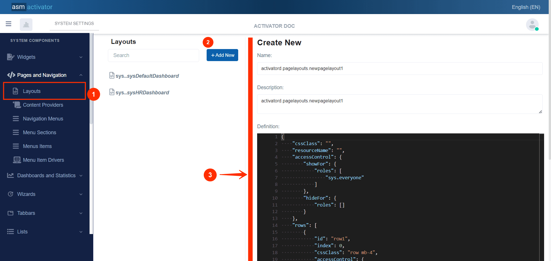
To initiate the creation of a Layout component, simply click on the +Add new button (illustrated at (2) on the image above). Upon clicking, you’ll observe a form (illustrated at (3) on the image above) appearing on the right side with some fields.

🔬After filling in the name and description fields, let's focus on the Definition and Meta Data fields.

The Meta Data field gathers and provides additional information for the component, such as configuration and parameters, as well as the accessibility and security measures associated with this component. Please refer to Meta Data for the complete list of additional information related to this component.

As for the Definition field, let's take a closer look at its JSON content.

{
    "cssClass": "",
    "resourceName": "",
    "accessControl": {
        "showFor": {
            "roles": [
                "sys.everyone"
            ]
        },
        "hideFor": {
            "roles": []
        }
    },
    "rows": [
        {
            "id": "row1",
            "index": 0,
            "cssClass": "row mb-4",
            "accessControl": {
                "showFor": {
                    "roles": [
                        "sys.everyone"
                    ]
                },
                "hideFor": {
                    "roles": []
                }
            },
            "columns": [
                {
                    "id": "row1Col1",
                    "index": 0,
                    "title": "Colunm Title",
                    "titleResKey": "",
                    "showTitle": false,
                    "contentProvider": "",
                    "cssClass": "col-lg-6",
                    "accessControl": {
                        "showFor": {
                            "roles": [
                                "sys.everyone"
                            ]
                        },
                        "hideFor": {
                            "roles": []
                        }
                    }
                },
                {
                    "id": "row1Col2",
                    "index": 1,
                    "title": "Colunm Title",
                    "titleResKey": "",
                    "showTitle": false,
                    "contentProvider": "",
                    "cssClass": "col-lg-6",
                    "accessControl": {
                        "showFor": {
                            "roles": [
                                "sys.everyone"
                            ]
                        },
                        "hideFor": {
                            "roles": []
                        }
                    }
                }
            ]
        },
        {
            "id": "row2",
            "index": 1,
            "cssClass": "row mb-4",
            "accessControl": {
                "showFor": {
                    "roles": [
                        "sys.everyone"
                    ]
                },
                "hideFor": {
                    "roles": []
                }
            },
            "columns": [
                {
                    "id": "row2Col1",
                    "index": 0,
                    "title": "Colunm Title",
                    "titleResKey": "",
                    "showTitle": false,
                    "contentProvider": "",
                    "cssClass": "col-lg-12",
                    "accessControl": {
                        "showFor": {
                            "roles": [
                                "sys.everyone"
                            ]
                        },
                        "hideFor": {
                            "roles": []
                        }
                    }
                }
            ]
        }
    ]
}

For clarity, let's break down this code into two sections:


The main container

The structure of the main container is defined by all the properties present at the root of the JSON object.

{
    "cssClass": "",
    "resourceName": "",
    "accessControl": {
        "showFor": {
            "roles": [
                "sys.everyone"
            ]
        },
        "hideFor": {
            "roles": []
        }
    },
    "rows": [ /* List of rows, each containing their own columns */ ]
}


PROPERTYREQUIREDDEFAULT VALUEDESCRIPTION
cssClassNo""Allows adding a CSS class to give the desired style to the Layout.
ressourceNameNo""The associated language resource.
accessControlYes
{
	"showFor":{
	"roles": [
		"sys.everyone"
	},
	"hideFor":{
		"roles": []
	}
}

This allows configuring the security aspect regarding the visibility of this layout on Activator Client. This object contains 2 properties:
- showFor specifies the roles (in the roles property in the left cell) and the roleFilters for which the element should be displayed.
- hideFor specifies the roles (in the roles property in the left cell) and the roleFilters for which the element should not be displayed.

⚠️Exception: The value sys.everyone in the roles table (of the showFor property in the left table) allows applying this condition to all users of the tenant.

📒NOTE: For restrictions on attribute values for certain roles, the roleFilter property must be used on the same row as roles.
Example:

{
    "showFor": {
        "roles": [],
        "roleFilters": [
            {
                "roleName": "activatord.roles.headOfService",
                "attributeValues": [
                    {
                        "attributeName": "department",
                        "value": "ui"
                    }
                ]
            }
        ]
    },
    "hideFor": {
        "roles": ["activatord.roles.seller"]
    }
}
rowsYes
[
    {
        "id": "row1",
        "index": 0,
        "cssClass": "row mb-4",
        "accessControl": {
            "showFor": {
                "roles": [
                    "sys.everyone"
                ]
            },
            "hideFor": {
                "roles": []
            }
        },
        "columns": [
            {
                "id": "row1Col1",
                "index": 0,
                "title": "Colunm Title",
                "titleResKey": "",
                "showTitle": false,
                "contentProvider": "",
                "cssClass": "col-lg-6",
                "accessControl": {
                    "showFor": {
                        "roles": [
                            "sys.everyone"
                        ]
                    },
                    "hideFor": {
                        "roles": []
                    }
                }
            },
            {
                "id": "row1Col2",
                "index": 1,
                "title": "Colunm Title",
                "titleResKey": "",
                "showTitle": false,
                "contentProvider": "",
                "cssClass": "col-lg-6",
                "accessControl": {
                    "showFor": {
                        "roles": [
                            "sys.everyone"
                        ]
                    },
                    "hideFor": {
                        "roles": []
                    }
                }
            }
        ]
    },
    {
        "id": "row2",
        "index": 1,
        "cssClass": "row mb-4",
        "accessControl": {
            "showFor": {
                "roles": [
                    "sys.everyone"
                ]
            },
            "hideFor": {
                "roles": []
            }
        },
        "columns": [
            {
                "id": "row2Col1",
                "index": 0,
                "title": "Colunm Title",
                "titleResKey": "",
                "showTitle": false,
                "contentProvider": "",
                "cssClass": "col-lg-12",
                "accessControl": {
                    "showFor": {
                        "roles": [
                            "sys.everyone"
                        ]
                    },
                    "hideFor": {
                        "roles": []
                    }
                }
            }
        ]
    }
]
This is where we define our grids. This field allows us to first specify the rows, which in turn will contain (or not) columns

After completing the information specific to the main container, let's now focus on its content. The goal here is to create grids (similar to those implemented in Bootstrap).


The content of the main container

At this stage, it involves creating the actual grids. In other words, we will need to create one (or more) rows, and then define the columns each row will contain.


Layout rows

A Layout row is a container for columns. Rows are used to create horizontal groups of columns within a grid layout. A row is typically defined using the .row class and it ensures that the columns inside it are properly aligned and spaced. Rows are crucial for structuring and organizing the content on a web page, as they allow for the creation of complex layouts with multiple columns.
🔬Let's take a closer look at the fields involved in defining a row.
 

  {
        "id": "row1",
        "index": 0,
        "cssClass": "row mb-4",
        "accessControl": {
            "showFor": {
                "roles": [
                    "sys.everyone"
                ]
            },
            "hideFor": {
                "roles": []
            }
        },
        "columns": [ /* List of columns, each indicating their own content provider */ ]
    }


PROPERTYREQUIREDDEFAULT VALUEDESCRIPTION
idYesrow1, row2, etc...The value used to uniquely identify the row
indexYes0Defines the display order of the row, from top to bottom, in ascending order
cssClassNorow mb-4Allows adding a CSS class to give the desired style to the Layout.
accessControlYes
{
	"showFor":{
	"roles": [
		"sys.everyone"
	},
	"hideFor":{
		"roles": []
	}
}

This allows configuring the security aspect regarding the visibility of this row on Activator Client. This object contains 2 properties:
- showFor specifies the roles (in the roles property in the left cell) and the roleFilters for which the element should be displayed.
- hideFor specifies the roles (in the roles property in the left cell) and the roleFilters for which the element should not be displayed.

⚠️Exception: The value sys.everyone in the roles table (of the showFor property in the left table) allows applying this condition to all users of the tenant.

📒NOTE: For restrictions on attribute values for certain roles, the roleFilter property must be used on the same row as roles.
Example:

{
    "showFor": {
        "roles": [],
        "roleFilters": [
            {
                "roleName": "activatord.roles.headOfService",
                "attributeValues": [
                    {
                        "attributeName": "department",
                        "value": "ui"
                    }
                ]
            }
        ]
    },
    "hideFor": {
        "roles": ["activatord.roles.seller"]
    }
}
colsYes
[
            {
                "id": "row1Col1",
                "index": 0,
                "title": "Colunm Title",
                "titleResKey": "",
                "showTitle": false,
                "contentProvider": "",
                "cssClass": "col-lg-6",
                "accessControl": {
                    "showFor": {
                        "roles": [
                            "sys.everyone"
                        ]
                    },
                    "hideFor": {
                        "roles": []
                    }
                }
            },
            {
                "id": "row1Col2",
                "index": 1,
                "title": "Colunm Title",
                "titleResKey": "",
                "showTitle": false,
                "contentProvider": "",
                "cssClass": "col-lg-6",
                "accessControl": {
                    "showFor": {
                        "roles": [
                            "sys.everyone"
                        ]
                    },
                    "hideFor": {
                        "roles": []
                    }
                }
            }
        ]
This is where we define the grids. This field allows us to specify the columns of this row


Layout columns

A Layout column refers to a column in the Activator grid system. It is typically defined using the .col class and is used to layout columns within a grid, allowing for structured and responsive content across different screen sizes.

Let's examine the specific fields that are used to define a column.

 {
    "id": "row1Col1",
    "index": 0,
    "title": "Colunm Title",
    "titleResKey": "",
    "showTitle": false,
    "contentProvider": "",
    "cssClass": "col-lg-6",
    "accessControl": {
        "showFor": {
            "roles": [
                "sys.everyone"
            ]
        },
        "hideFor": {
            "roles": []
        }
    }
}


PROPERTYREQUIREDDEFAULT VALUEDESCRIPTION
idYesrow1Col1, row1Col2, row2Col1, etc...The value used to uniquely identify the column
indexYes0Defines the display order of the column, from left to right, in ascending order
titleYescolumn TitleThe column title
titleResKeyNo""Translation key of the column title
showTitleNofalseSpecifies whether to display the column title or not
contentProviderNo""The name of the content provider that will render the UI.
cssClassNocol-lg-6Allows adding a CSS class to give the desired style to the layout column.
accessControlYes
{
	"showFor":{
	"roles": [
		"sys.everyone"
	},
	"hideFor":{
		"roles": []
	}
}

This allows configuring the security aspect regarding the visibility of this column on Activator Client. This object contains 2 properties:
- showFor specifies the roles (in the roles property in the left cell) and the roleFilters for which the element should be displayed.
- hideFor specifies the roles (in the roles property in the left cell) and the roleFilters for which the element should not be displayed.

⚠️Exception: The value sys.everyone in the roles table (of the showFor property in the left table) allows applying this condition to all users of the tenant.

📒NOTE: For restrictions on attribute values for certain roles, the roleFilter property must be used on the same row as role.
Example:

{
    "showFor": {
        "roles": [],
        "roleFilters": [
            {
                "roleName": "activatord.roles.headOfService",
                "attributeValues": [
                    {
                        "attributeName": "department",
                        "value": "ui"
                    }
                ]
            }
        ]
    },
    "hideFor": {
        "roles": ["activatord.roles.seller"]
    }
}


How to Render a Layout Page

To render a layout on Activator Client, simply instantiate it and pass in certain parameters. During this instantiation, Activator retrieves the definition of the layout as well as the content providers for each of its columns. Next, the rows and their columns (of this layout) are rendered based on the values specified in their properties (such as cssClass and others). Finally, each content provider specified in each column is instantiated, with the container being the column where the content provider was specified.

💻There are two ways to render a layout on Activator:

  1. Automatically by Activator: This occurs when you click on a menu item and, in its definition, the layout is specified in the layout property.
  2. Manually in JavaScript: To manually initialize and display a layout on Activator Client, you can use the following code in a driver, helper, or content provider.

    $activator.ui.renderLayout({
        name: "activatord.pagelayouts.memberLayoutDemo", // The name of the layout component
        model: {
            /*
            Add the data you want to pass to content providers here
            and get them into that content providers with context.model
            */
        }
    })


Conclusion

👏Now that we have explored the Layout component and its ability to structure user interfaces in grid form while managing the security and privileges of these sections, let's move on to the study of the content provider component. The content provider is responsible for managing and supplying the content within the columns defined by the Layout, enabling dynamic and personalized interaction for each section.