List
Intro
List View is a component in Activator designed to display dynamic data in an HTML table. It leverages the JavaScript DataTable component to provide a robust and streamlined solution for efficiently presenting and managing large amounts of data. By utilizing a specified data source, the List View simplifies the implementation of interactive and responsive tables while offering advanced features such as sorting, pagination, and search. This component optimizes data display while reducing development time required for creating interactive tables.
Graphic example
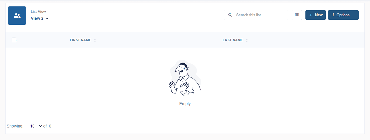
Structurally, once interpreted, a list renders like the image above. However, let's highlight the different structures that make up the List component
The breakdown reveals nine main parts:
- List icon
- Title List
- Button to change list view
- Search bar to find an element in the view
- button to collapse the list. The idea is to collapse the list container in order to create another container to display more details about an element in a list view.
- Buttons a actions for a list view.
- Line for the titles of each column.
- list view element container
view list header.
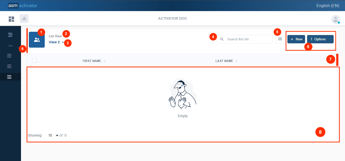
Before going into detail about the various structures resulting from the decomposition of a ListView (illustrated in the image above ☝️), let's start by focusing on the creation of a List component on Activator Admin🤫.
Creation
The creation of List View components on Activator Admin allows us to build a visual representation of a data collection on several views. This user interface widget is managed by four main components:
- List View: Contains the definition of the main elements of the table, including views and action buttons.
- List View Driver: Manages behaviors and events related to the List View.
- View: Defines the main view by binding the data source, arranging the columns, and managing security privileges.
- View Driver: Customizes the view and handles behaviors for events and actions in the List View.
List View
This is the main component responsible for defining the main elements of the data table, such as the different views taken into account, the different action buttons, etc.
Creation
In Activator Admin , the List view component is located within the menu container, among the items listed under List📑. As shown at (1) on the image below.
NB🚨: Make sure you are in the System Component main module.
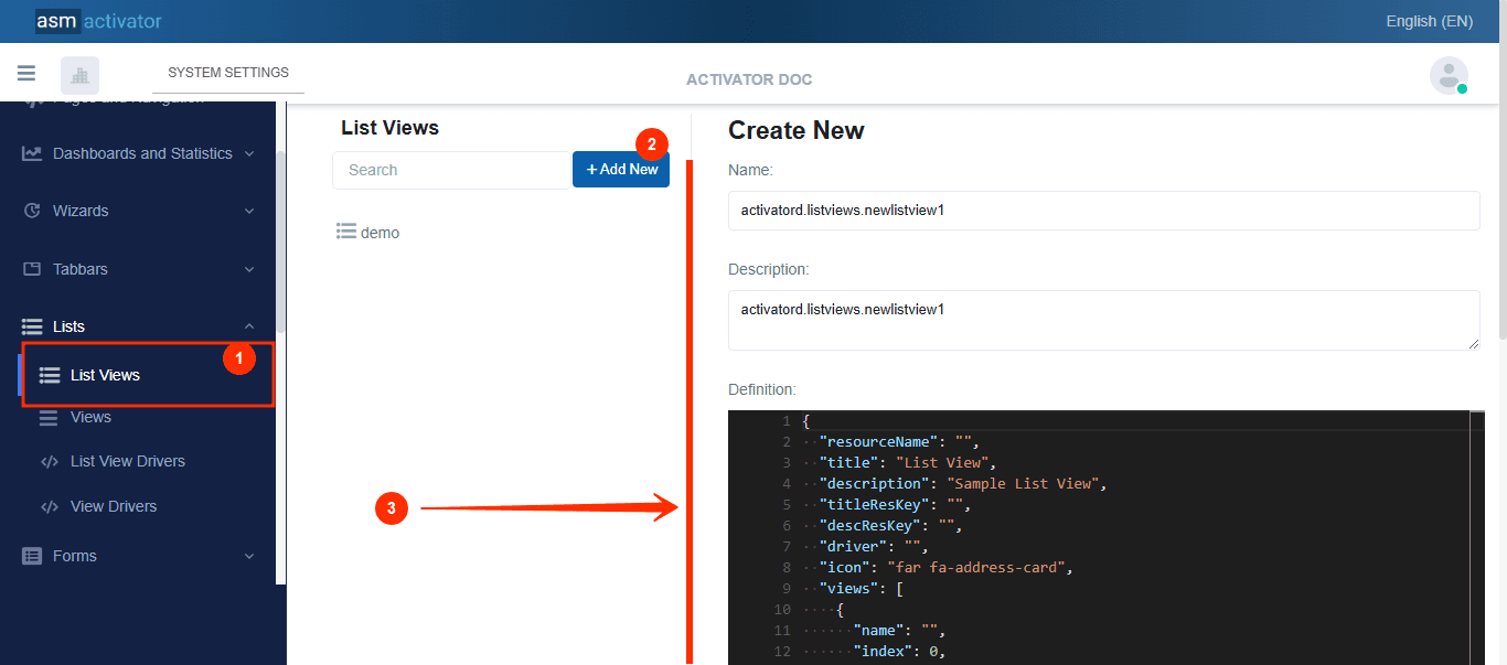
After initiating the creation of the List view, by clicking on the +Add new button (illustrated at (2) on the image above), you’ll observe a form (illustrated at (3) on the image above) appearing on the right side with some fields.
🔬After filling in the name and description fields, let's focus on the Definition and Meta Data fields.
The Meta Data field gathers and provides additional information for the component, such as configuration and parameters, as well as the accessibility and security measures associated with this component. Please refer to Meta Data for the complete list of additional information related to this component.
As for the Definition field, let's take a closer look at its JSON content.
{
    "resourceName": "",
    "title": "List View",
    "description": "Sample List View",
    "titleResKey": "",
    "descResKey": "",
    "driver": "",
    "icon": "far fa-address-card",
    "views": [
        {
            "name": "",
            "index": 0,
            "visibleFor": {
                "roles": [
                    "sys.everyone"
                ]
            }
        }
    ],
    "buttons": [
        {
            "name": "new",
            "index": 0,
            "title": "New",
            "titleResKey": "",
            "icon": "tio-add",
            "options": [],
            "visibleFor": {
                "roles": [
                    "sys.everyone"
                ]
            }
        },
        {
            "name": "options",
            "index": 1,
            "title": "Options",
            "titleResKey": "",
            "icon": "tio-more-vertical",
            "options": [
                {
                    "id": "option1",
                    "title": "Option 1",
                    "icon": "fas fa-edit",
                    "visibleFor": {
                        "roles": [
                            "sys.everyone"
                        ]
                    }
                },
                {
                    "id": "option2",
                    "title": "Option 2",
                    "icon": "fas fa-edit",
                    "visibleFor": {
                        "roles": [
                            "sys.everyone"
                        ]
                    }
                }
            ],
            "visibleFor": {
                "roles": [
                    "sys.everyone"
                ]
            }
        }
    ]
}
Description
| PROPERTY | REQUIRED | DEFAULT VALUE | DESCRIPTION |
|---|---|---|---|
resourceName | Yes | "" | Represents the associated language resource. |
title | No | list view | List view title. |
description | No | Simple list view | List view description |
titleResKey | No | "" | Resource language key of the title. |
descResKey | No | "" | Resource language key for the description. |
driver | Yes | "" | This is the list view driver |
icon | No | far fa-address-card | list view icon |
view | Yes | | It is used to define the different views (or perspectives) that will be available in the List View.
|
buttons | No | | It is used to define the action buttons available in the List View, allowing users to interact with the data displayed in the table. Each button can represent a specific action or a group of options, and their behavior as well as their visibility can be customized.
|
List View Driver
The List View Driver is an essential component that acts as a controller for the List View. It allows specific behaviors to be attached to various events and actions related to the data table.
Creation
In Activator Admin , the List view driver component is located within the menu container, among the items listed under List📑. As shown at (1) on the image below.
NB🚨: Make sure you are in the System Component main module.
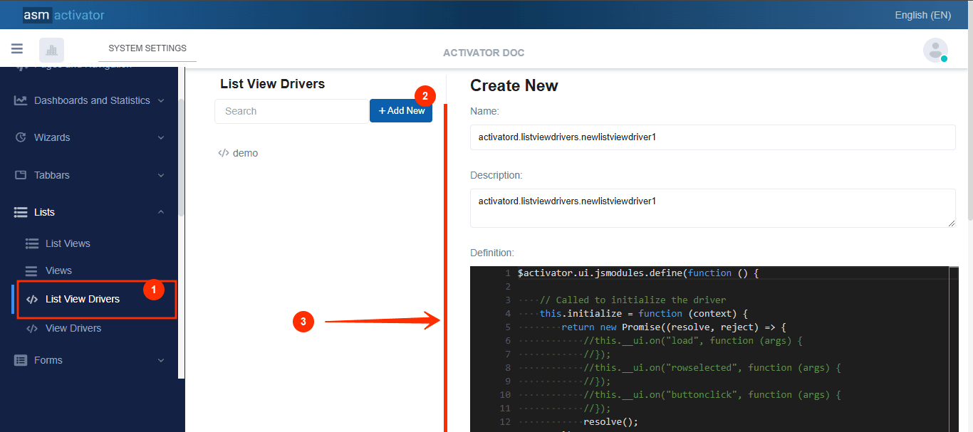
After initiating the creation of the List view driver, by clicking on the +Add new button (illustrated at (2) on the image above), you’ll observe a form (illustrated at (3) on the image above) appearing on the right side with some fields.
🔬After filling in the name and description fields, let's focus on the Definition and Meta Data fields.
The Meta Data field gathers and provides additional information for the component, such as configuration and parameters, as well as the accessibility and security measures associated with this component. Please refer to Meta Data for the complete list of additional information related to this component.
As for the Definition field, let's take a closer look at its JavaScript content.
$activator.ui.jsmodules.define(function () {
    // Called to initialize the driver
    this.initialize = function (context) {
        return new Promise((resolve, reject) => {
            //this.__ui.on("load", function (args) {
            //});
            //this.__ui.on("rowselected", function (args) {
            //});
            //this.__ui.on("buttonclick", function (args) {
            //});
            resolve();
        });
    };
});w
Description
| EVENT / FUNCTION | DESCRIPTION |
|---|---|
initialize() | The initialize() method prepares the component by initializing the necessary configuration. Inside this method, this.__ui is an object that represents the user interface of the List View. The on() method of this.__ui is used to attach events to this interface. |
this.__ui.on("load", function (args) {...}) | this.__ui.on("load", function (args) {...}) is used to listen for the loading event of the List View. This allows an action to be executed as soon as the List View is fully loaded in the interface. args contains information about the event or the state during the loading. |
this.__ui.on("rowselected", function (args) {...}) | The rowselected event is triggered when a user clicks on a row in the table. The code this.__ui.on("rowselected", function (args) {...}) allows retrieving the index or data of the selected row from the args object. |
this.__ui.on("buttonclick", function (args) {...}) | It allows binding a click event to a specific button in the List View. args contains information related to the clicked button (name, ID, etc.), which allows customizing the action based on the button. |
Note🛑: Logging the
argargument of the above events, we have👇 :
| EVENT | DESCRIPTION |
|---|---|
load | |
rowSelected | |
buttonClick |
View
The View component is responsible for managing the detailed definition of a view within the List View. It handles everything from binding the data source to the definition of column layouts, ensuring that the data is displayed accurately and efficiently. Additionally, it takes into account security aspects by managing access privileges, ensuring that only authorized users can view or interact with certain data or features. This component plays a critical role in providing a flexible and secure data presentation layer while maintaining a clean separation between data handling and the user interface.
Creation
In Activator Admin , the View component is located within the menu container, among the items listed under List📑. As shown at (1) on the image below.
NB🚨: Make sure you are in the System Component main module.
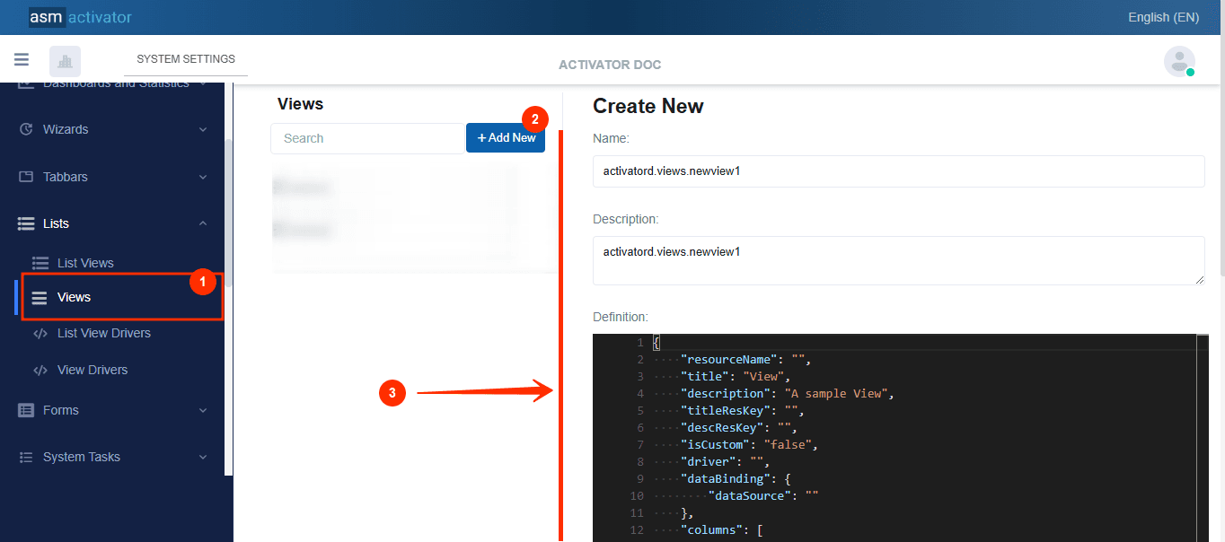
After initiating the creation of the view, by clicking on the +Add new button (illustrated at (2) on the image above), you’ll observe a form (illustrated at (3) on the image above) appearing on the right side with some fields.
🔬After filling in the name and description fields, let's focus on the Definition and Meta Data fields.
The Meta Data field gathers and provides additional information for the component, such as configuration and parameters, as well as the accessibility and security measures associated with this component. Please refer to Meta Data for the complete list of additional information related to this component.
As for the Definition field, let's take a closer look at its Json content.
{
    "resourceName": "",
    "title": "View",
    "description": "A sample View",
    "titleResKey": "",
    "descResKey": "",
    "isCustom": "false",
    "driver": "",
    "dataBinding": {
        "dataSource": ""
    },
    "columns": [
        {
            "name": "firstName",
            "index": 0,
            "title": "First Name",
            "titleResKey": "",
            "dataBinding": {
                "dataMember": "firstName"
            },
            "visibleFor": {
                "roles": [
                    "sys.everyone"
                ]
            }
        },
        {
            "name": "lastName",
            "index": 0,
            "title": "Last Name",
            "titleResKey": "",
            "dataBinding": {
                "dataMember": "lastName"
            },
            "visibleFor": {
                "roles": [
                    "sys.everyone"
                ]
            }
        }
    ]
}
Description
| PROPERTY | REQUIRED | DEFAULT VALUE | DESCRIPTION |
|---|---|---|---|
resourceName | Yes | "" | Represents the associated language resource. |
title | No | view | View title. |
description | No | A simple view | View description |
titleResKey | No | "" | Resource language key of the title. |
descResKey | No | "" | Resource language key for the description. |
isCustom | Yes | false | It is used to indicate whether the view is customized or not. When set to false, it means the view is standard and uses the default settings or behaviors defined in the Activator system. On the other hand, when set to true, it means the view has been customized, and specific configurations or behaviors have been applied to this view directly by the user. |
driver | No | "" | This is the view driver |
dataBinding | Yes | | It links data from an external source to the view. It allows specifying the data source and defining how this data should be mapped or connected to the elements of the view. |
columns | Yes | | The
|
View Driver
The View Driver component allows for detailed customization of a List View by adjusting its appearance and behavior. It provides the ability to modify specific elements of the view, such as the column layout, visual styles, or the addition of interactive features. In addition to customizing the view, the View Driver enables the attachment of behaviors to various events and actions related to the List View, such as clicks on rows or buttons, using events similar to those defined in the List View Driver.
Creation
In Activator Admin , the View component is located within the menu container, among the items listed under List📑. As shown at (1) on the image below.
NB🚨: Make sure you are in the System Component main module.
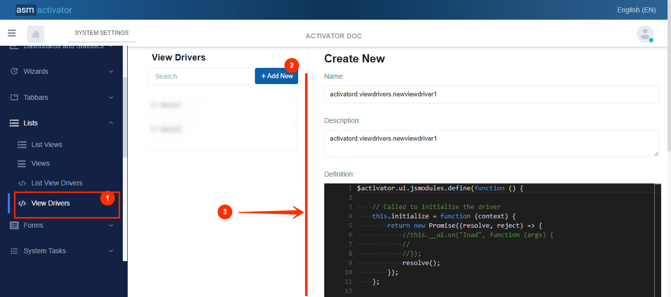
After initiating the creation of the view driver, by clicking on the +Add new button (illustrated at (2) on the image above), you’ll observe a form (illustrated at (3) on the image above) appearing on the right side with some fields.
🔬After filling in the name and description fields, let's focus on the Definition and Meta Data fields.
The Meta Data field gathers and provides additional information for the component, such as configuration and parameters, as well as the accessibility and security measures associated with this component. Please refer to Meta Data for the complete list of additional information related to this component.
As for the Definition field, let's take a closer look at its JavaScript content.
$activator.ui.jsmodules.define(function () {

    // Called to initialize the driver
    this.initialize = function (context) {
        return new Promise((resolve, reject) => {
            //this.__ui.on("load", function (args) {
            //
            //});
            //this.__ui.on("columnDataBind", function (args) {

            //
            //});
            //this.__ui.on("columnDataBind", function (args) {

			//
            //});
            resolve();
        });
    };

    //Render the content
    this.render = function (context) {
        return new Promise((resolve, reject) => {
            resolve();
        });
    };


    //Builds the data source arguments
    this.buildDataSourceArgs = function (context) {
        return new Promise((resolve, reject) => {

            //for stored functions
            //resolve({
            //    arguments: []
            //});

            //for stored queries
            resolve({
                parameters: []
            });
        });
    };

});
View Driver Configuration
NB🚨: The context provided as an argument in the following list of events encompasses both the information passed during the instantiation of the List View and the current contextual data related to the user interface of the view.
initialize()View initialization.
Inside, we can access the property
this.__ui, which allows us to listen to and attach different behaviors to events such as:
| EVENTS | DESCRIPTION |
|---|---|
this.__ui.on("load", function (args) {...}) | Action triggered when the List View is initialized. This event is used to execute tasks during the loading phase of the List View, such as setting up additional configurations or fetching data from external sources. |
this.__ui.on("columnDataBind", function (args) {...}) | Allows developers to manipulate data and customize the display of each column in the table. Developers can use a Example: |
this.__ui.on("rowDataBind", function (args) {...}) | Enables developers to manipulate data and customize the appearance of each row in the table. Using a Example: |
render()It provides developers with the ability to customize the display logic of the view, tailoring its content and behavior to meet specific needs.
buildDataSourceArgs()Allows the developer to design or customize the arguments or parameters of the data source bound to the view.
NB🚨: The developer must ensure that the appropriate information is provided based on the type of data source bound to the view:
- Use
resolve({ parameters: [] });if astoredQueryis bound to the view.- Use
resolve({ arguments: [] });if astoredFunctionis bound to the view.
| EVENTS | DESCRIPTION |
|---|---|
onBeforeRowDataBind() | Triggered before the data-binding process for a row. Allows customization or modification of data before it is displayed in the row. |
onAfterRowDataBind() | Triggered after the data has been bound to a row. Enables applying specific styles or behaviors to the row once the data is displayed. |
onBeforeColumnDataBind() | Triggered before the data-binding process for a column. Ideal for manipulating or customizing data before it is displayed in a cell. |
onAfterColumnDataBind() | Triggered after the data has been bound to a column. Allows adjustments to the display or final modifications to the cell. |
How To Instanciate A List View
To instantiate a list view, the following method is used:
$activator.ui.renderListView({
        container: "", // The JQuery DOM container
        name: "", // The List View name
        model: {
        // Add the necessary data for the List View here
        // If your List View does not expect any param, just send an empty object {}
    }
}).then((listView) => {
    //Stuffs to do after the listView is rendered
});
✋IMPORTANT: List View Initialization can be done anywhere in component of type Driver (Helper, Content Provider, Driver, Menu Item Driver, Tabbar Driver, etc…).
Conclusion
In conclusion, the List View component in Activator provides a powerful and flexible solution for displaying and managing data in an interactive table. Through its various sub-components, such as the List View Driver, View, and View Driver, it enables advanced customization, efficient event handling, and precise configuration of columns and actions. This component ensures an optimized user experience while reducing development complexity. After exploring the numerous possibilities offered by the List View, it is only natural to turn to the Form component, which complements this dynamic by simplifying data entry and management.