TabBars
A TabBar is a user interface component that allows users to easily navigate between multiple views or sections of an application by selecting specific tabs. Each tab acts as a direct access point to a separate section, enabling users to switch quickly between different application features or content.
In addition to enhancing the user experience, this component allows for grouping similar functionalities under separate tabs and organizing content in a logical and comprehensible way.
Visual rendering of a TabBar on Activator Client
Structurally, once interpreted, the rendering of a tabbar looks like the image above.
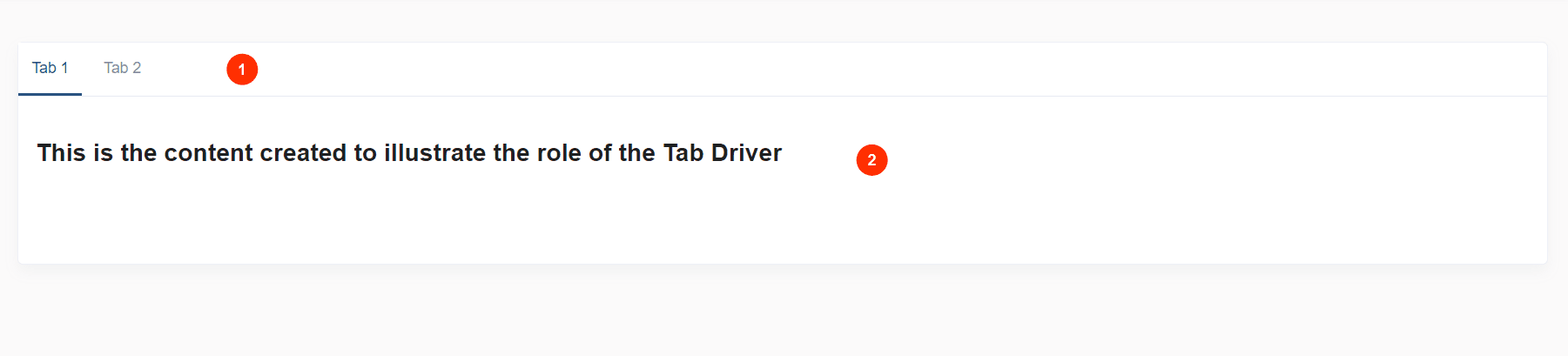
The decomposition reveals two main parts:
- The tabs list. The tab underlined in blue is the active tab.
- The tab content of the active tab.
Before delving into detailed explanations of the various structures resulting from the TabBar's decomposition (illustrated in the image above☝️), let's first focus on creating a TabBar component on Activator Admin🤫.
TabBar On Activator Admin
Creating TabBar components on Activator Admin is a structured process that allows developers to design user interfaces for better organization of data display. This UI widget is managed by three main components:
- The tabBar, which contains the actual definition of the tabBar.
- The tabBar driver, which allows developers to listen to general tabBar events and attach behaviors to them.
- The tab driver, which displays and manages the content of a tab.
This process begins with initializing a new tabBar, where the number of tabs and their sequence are defined. The content of each tab in this definition will be managed through its tab driver. Activator Admin also facilitates the management of created tabBars, enabling their modification and deletion as needed.
TabBar (Definition)
In Activator Admin , the TabBar component is located within the menu container, among the items listed under </>Tabbars. As shown at (1) on the image below.
✋CAUTION
Make sure you are in the System Component main module
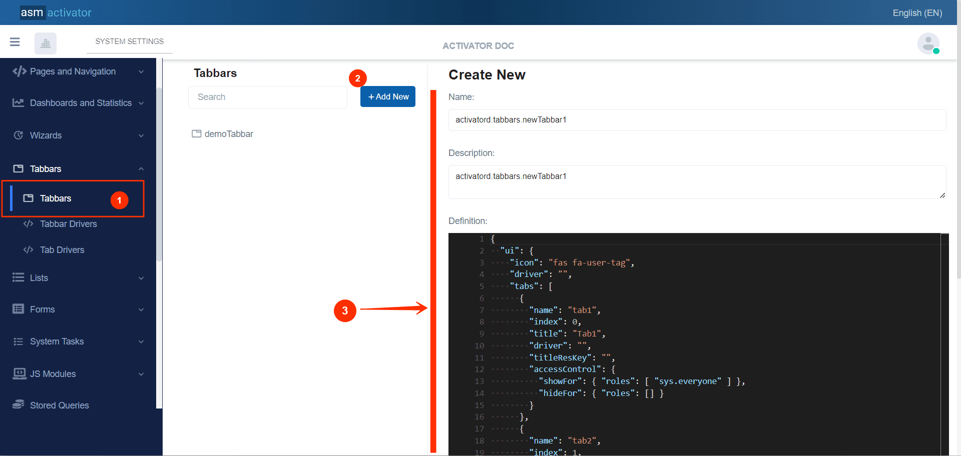
To initiate the creation of a TabBar component, simply click on the +Add new button (illustrated at (2) on the image above). Upon clicking, you’ll observe a form (illustrated at (3) on the image above) appearing on the right side with some fields.
🔬After filling in the name and description fields, let's focus on the Definition and Meta Data fields.
The Meta Data field gathers and provides additional information for the component, such as configuration and parameters, as well as the accessibility and security measures associated with this component. Please refer to Meta Data for the complete list of additional information related to this component.
As for the Definition field, let's take a closer look at its JSON content. Notice that it's here where you will be prompted to fill in various fields. These fields will be used to specify information relating to the identification of the TabBar and its tabs.
{
    "resourceName": "",
    "driver": "",
    "tabs": [
        {
            "name": "tab name",
            "index": 0,
            "title": "Tab Title",
            "driver": "",
            "titleResKey": "",
            "accessControl": {
                "showFor": {
                    "roles": [
                        "sys.everyone"
                    ]
                },
                "hideFor": {
                    "roles": []
                }
            }
        },
        {
            "name": "tab name",
            "index": 1,
            "title": "Tab Title",
            "driver": "",
            "titleResKey": "",
            "accessControl": {
                "showFor": {
                    "roles": [
                        "sys.everyone"
                    ]
                },
                "hideFor": {
                    "roles": []
                }
            }
        }
    ]
}
| PROPERTY | REQUIRED | DEFAULT VALUE | DESCRIPTION |
|---|---|---|---|
ressourceName | No | "" | Represents the associated language resource |
driver | No | "" | This (component) will allow us to access and to listen its main events and attach behaviors to them. More details about the #TabBar Driver. |
tabs | Yes | | This property contains the list of tabs of our TabBar. The minimum number of tabs required to register is 2. - ⚠️Exception: The value 📒NOTE: For restrictions on attribute values for certain roles, the |
Tabbar Drivers
Being a type of Driver, this component allows the developer to manage tabBar interactions such as initialization and tab clicks.
✋NB: The use of TabBar Drivers is not mandatory in the creation of a TabBar.
Creation
In Activator Admin , the TabBar Driver component is located within the menu container, among the items listed under </>Tabbars. As shown at (1) on the image below.
NB: Make sure you are in the System Component main module.
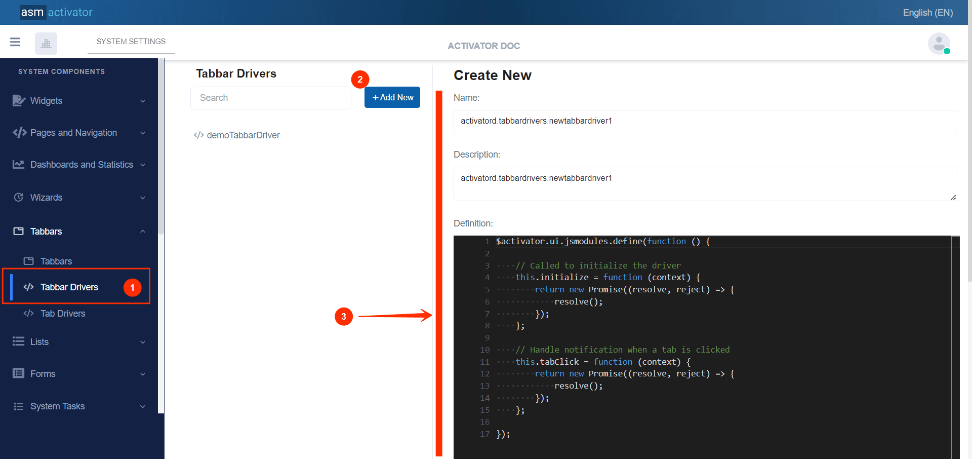
After initiating the creation of the TabBar Driver, by clicking on the +Add new button (illustrated at (2) on the image above), you’ll observe a form (illustrated at (3) on the image above) appearing on the right side with some fields.
🔬After filling in the name and description fields, let's focus on the Definition and Meta Data fields.
NB: The name you filled will be the value that you must enter inside the `driver` value in the the #TabBar Definition
The Meta Data field gathers and provides additional information for the component, please refer to Meta Data for the complete list of additional information related to this component.
As for the Definition field, let's take a closer look at its Javascript content in the next point.
Configuration
The code below presents a basic implementation of the tabBar driver, with essential methods to initialize and notify tab clicks. Each of these methods returns a promise (Promise), allowing operations to be handled asynchronously and reliably. This basic model can be extended to include custom logic based on the specific needs of your application.
$activator.ui.jsmodules.define(function () {
    /**
     * Called to initialize the driver.
     * This function is responsible for preparing the TabBar driver context.
     * It ensures that all necessary configurations and initial setups are in place before the TabBar is rendered.
     *
     * @param {Object} context - The context object that contains information and settings for the TabBar driver.
     * @returns {Promise} - A promise that resolves when the initialization is complete.
     */
    this.initialize = function (context) {
        return new Promise((resolve, reject) => {
            // Perform initialization tasks here
            // Resolve the promise once initialization is complete
            resolve();
        });
    };
    /**
     * Handle notification when a tab event occurs.
     * This function manages the actions and processes that should occur when a user interacts with a TabBar tab.
     *
     * @param {Object} context - The context object that contains information about the event tab and the current state of the TabBar.
     * @returns {Promise} - A promise that resolves when the event handling is complete.
     */
    this.tabClick = function (context) {
        return new Promise((resolve, reject) => {
            // Perform tasks related to tab event here
            // Resolve the promise once event handling is complete
            resolve();
        });
    };
});
Events Descriptions
- Event
initialize
// Called to initialize the driver
this.initialize = function (context) {
    return new Promise((resolve, reject) => {
        // Custom initialization logic here
        resolve();
    });
};
Description: This method is called to initialize the tabbar driver. Receives as argument the context that was sent when the tabBar was instantiated.
Parameter: context - An object containing configuration information and parameters needed for initialization.
Use case:
- Customize the UI before rendering the TabBar
- Perform certain checks before displaying the TabBar
- Configure basic settings before launching the TabBar
- Prepare data before launching the TabBar
- Set up permissions before displaying the TabBar
- Event
tabClick
// Called to notify tab clicks
this.tabClick = function (context) {
    return new Promise((resolve, reject) => {
        // Custom move handling logic here
        resolve();
    });
};
Description: This event is triggered each time the user clicks a tab. It allows the developer to define, in a general manner, the specific behaviors that should occur when the user interacts with the tabs..
Parameter: context - An object containing configuration information and parameters needed for tabs content renderings.
Tab Drivers
Also being a type of Driver, the Tab Driver component allows the developer to define the visual and interactive rendering of the content of a tab.Creation.
Creation
In Activator Admin , the Tab Driver component is located within the menu container, among the items listed under </>Tabbars. As shown at (1) on the image below.
✋CAUTION
Make sure you are in the System Component main module
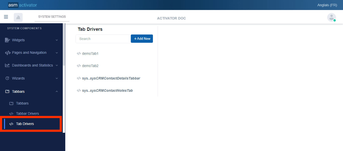
After initiating the creation of the Tab driver, by clicking on the +Add new button (illustrated at (2) on the image above), you’ll observe a form (illustrated at (3) on the image above) appearing on the right side with some fields.
🔬After filling in the name and description fields, let's focus on the Definition and Meta Data fields.
NB: The name you filled will be the value that you must enter inside the driver value of a tab in the #TabBar Definition
The Meta Data field gathers and provides additional information for the component, please refer to Meta Data for the complete list of additional information related to this component.
As for the Definition field, let's take a closer look at its Javascript content in the next point.
Configuration
The basic code that defines a JavaScript snippet for the Tab Driver component in Activator Admin is as follows:
$activator.ui.jsmodules.define(function () {
    // Called to initialize the driver
    this.initialize = function (context) {
        return new Promise((resolve, reject) => {
            resolve();
        });
    };
    //Render tab content
    this.render = function (context) {
        return new Promise((resolve, reject) => {
            resolve();
        });
    };
});
The module utilizes promise functions to handle the both stages of initialization and rendering of a tab in the TabBar. Here's a detailed explanation of each aspect of the code and examples of functions you might include in each part:
Event initialize
// Called to initialize the driver
this.initialize = function (context) {
    return new Promise((resolve, reject) => {
        resolve();
    });
};- Description: Any action to be performed before the tab content is displayed.
- Parameter:
context- contains the container and others data sent on the instanciation of the TabBar. - Return: a promise that resolves when the initialization is complete.
Event render
//Render tab content
this.render = function (context) {
    return new Promise((resolve, reject) => {
        resolve();
    });
};
The render method is responsible for rendering the content for a tab. As with initialize, it takes a context as a parameter and returns a promise.
- Description: Displays and manage the content of the tab.
- Parameter:
context- contains the container and other data sent during the instantiation of the TabBar. - Return: A promise that resolves when the content is rendered
Tabs Extensions
As a modern ERP, Activator offers various flexible base modules that can be adapted to each tenant's specific needs. Once a module has been obtained by a tenant, they can decide to customize or extend certain components of that module, such as TabBars and others.
For a system TabBar (a system component belongs to a base module or package of Activator, and its definition cannot be modified by a tenant), Activator provides the ability to extend its tabs. This operation allows developers to add new tabs to those initially present in the TabBar definition.
Let's take a closer look at what this looks like in the following image.
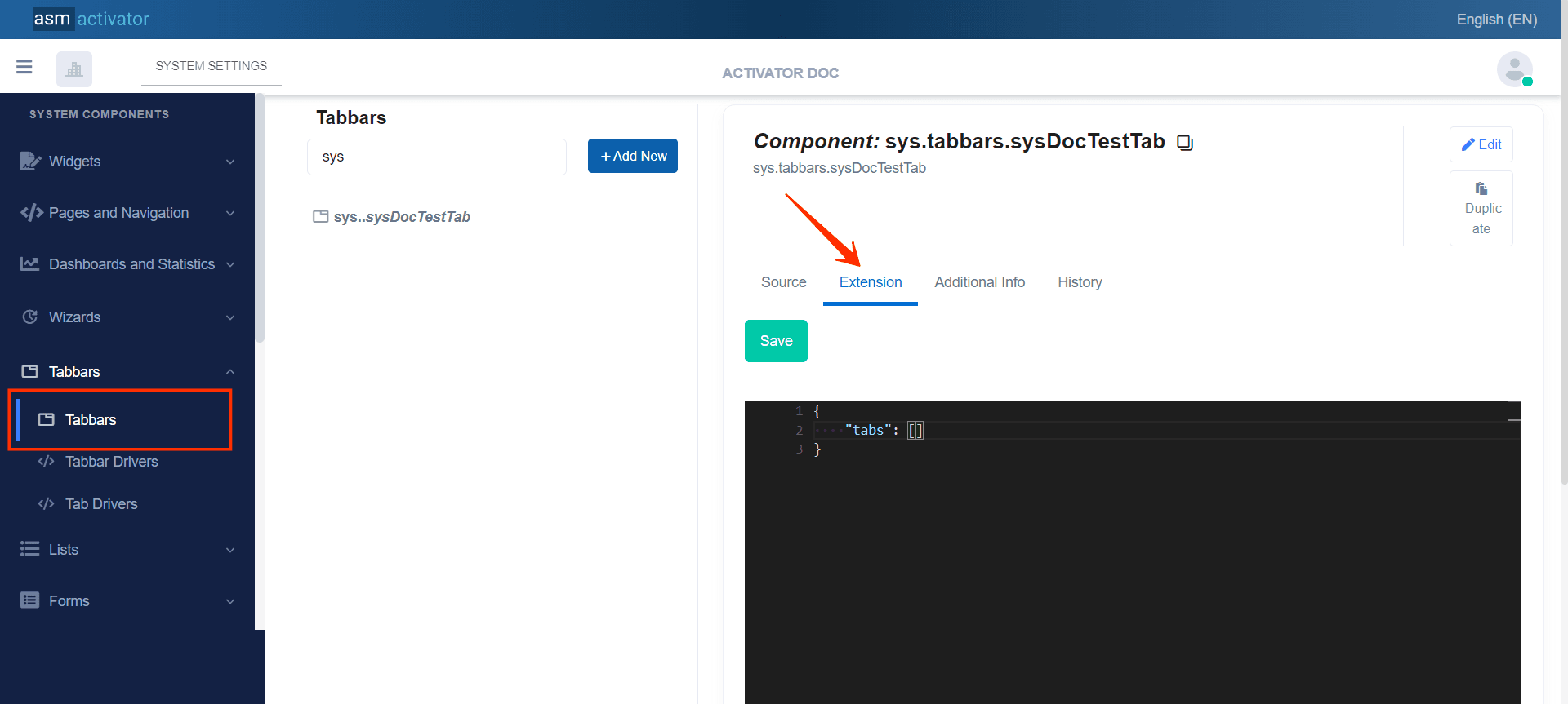
To access the extension of a TabBar, simply go to the Extension tab, to the right of the source tab where the component definition is displayed (as illustrated in the image above).
The default model provided is an object containing an initially empty collection of tabs. The elements to be inserted in this field must follow the same format as those inserted in the tabs field of the TabBar definition itself.
{
    "tabs": [
        {
            "name": "tab5",
            "index": 30,
            "title": "Additionnal Information",
            "driver": "activatord.tabbars.demoTabbar2",
            "titleResKey": "",
            "resourceName": "",
            "accessControl": {
                "showFor": {
                    "roles": [
                        "sys.everyone"
                    ]
                },
                "hideFor": {
                    "roles": []
                }
            }
        }
    ]
}
✋CAUTION
Extensions only apply to system TabBars.
The
nameattribute of the newly extended tab should not be previously used as anamein any of the tabs present in the base definition and must also be unique in the list of extended tabs.The extended tab will be mixed and sorted via its
indexfield with the other native tabs of the TabBar, then displayed according to the order obtained by the sorting. Therefore, the developer will need to adjust the value of theindexfield according to the display position they want the new extended tab to occupy.
How To Instanciate A TabBar
Below you will find the code needed for the TabBar instanciation.
const tabbarInstance = $activator.ui.renderTabbar({
    container: "", // The JQuery DOM container
    name: "", // The tabbar name
    model: {
        // Add the necessary data for the tabbar here such recorsIds, or thers data
        // If your tabbar does not expect any param, just send an empty object {}
    }
});
Description
Description: The $activator.ui.renderTabbar function is called to display a TabBar. This function takes an object as argument, with the following properties:
container: The DOM container where the TabBar will be rendered.name: The full name that identifies the TabBar to be displayed.model: The data model to be passed to the TabBar. In this example, an empty object is used, but in a real application, this object could contain data necessary for the TabBar to function.
Examples of use
Example 1: Instanciation in a Menu Item Driver
Let's consider in our example that we are in a Menu Driver Item, and we want to display our TabBar in the Menu Item that implements it. One of the solutions to do this is as follows:
$activator.ui.jsmodules.define(function () {
    // Called to initialize the driver
    this.initialize = function (context) {
        return new Promise((resolve, reject) => {
            resolve();
        });
    };
    // Manage menu item click event
    this.onItemClick = function (context) {
        const tabbarInstance = $activator.ui.renderTabbar({
            container: context.container,
            name: 'activatord.tabbars.demoTabbar',
            model: {
                recordId: "85eacb6d-2903-4aba-b6b6-75f2bd751fa5",
                firstName: "John",
                lastName: "Doe"
            }
        });
    };
});
✋IMPORTANT: TabBar Initialization can be done anywhere in component of type Driver (Helper, Content Provider, Driver, Menu Item Driver, #Tabbar Driver, etc…).
Example 2: Display data passed during the instanciation in the tab content
In our last example, during the instantiation of the TabBar, we passed an object containing the first name and last name of a user. The code below illustrates how to display this user's information in a tab content.
$activator.ui.jsmodules.define(function () {
    // Called to initialize the driver
    this.initialize = function (context) {
        return new Promise((resolve, reject) => {
            resolve();
        });
    };

    //Render tab content
    this.render = function (context) {
        return new Promise((resolve, reject) => {
            // According to our example, our context object contains the following:
            // value of the context => {
            //     ... // Other info (the main container et others stuffs)
            //     model: {
            //         recordId: "85eacb6d-2903-4aba-b6b6-75f2bd751fa5",
            //         firstName: "John",
            //         lastName: "Doe",
            //     }
            // }

            const CONTAINER = context.container
            CONTAINER.html(`
                <h2>Hello ${context.model.firstName}</h2>
                <p>Your last name: ${context.model.lastName}</p>
                <p>Your last name: ${context.model.firstName}</p>
            `)

            // Then, you can use the context.model.recordId to request others user info in the system
            resolve();
        });
    };
});
Conclusion
The Activator TabBar component is essential for organizing and structuring data within an application. It enables the creation of intuitive user interfaces where each tab can contain specific content and be subject to security constraints to protect sensitive information. Its flexibility and ability to efficiently manage user interactions make it a key tool for enhancing the user experience and data management in modern applications.