Dashboard
The Dashboard🚧 component in Activator is a central interface designed to display and track key information through dynamic widgets such as data, statistics, metrics, and graphical visualizations. It serves as a strategic entry point for users, providing a simplified overview of business processes derived from various application modules.
By incorporating customizable dynamic widgets, the dashboard enables efficient management of complex operational data, making it accessible and actionable. A major advantage lies in the flexibility of these widgets, which can be configured based on user privileges and reused in other Activator components, thereby promoting modularity and resource optimization.
Graphic Example
/**********///
Create A Dashboard
In Activator, the creation of a dashboard relies on the seamless interaction of five key components, each serving a specific role to ensure a dynamic, functional, and user-focused interface. Below is a detailed overview of these five components:
Dasboard Categories
This component allows for the general categorization of dashboards, enabling them to be grouped logically. It can be used to organize dashboards by modules or packages, ensuring a structured and intuitive classification.
Creation
In Activator Admin , the Dasboard categories component is located within the menu container, among the items listed under Dashboard and Statistics📈. As shown at (1) on the image below.
NB🚦: Make sure you are in the System Component main module.
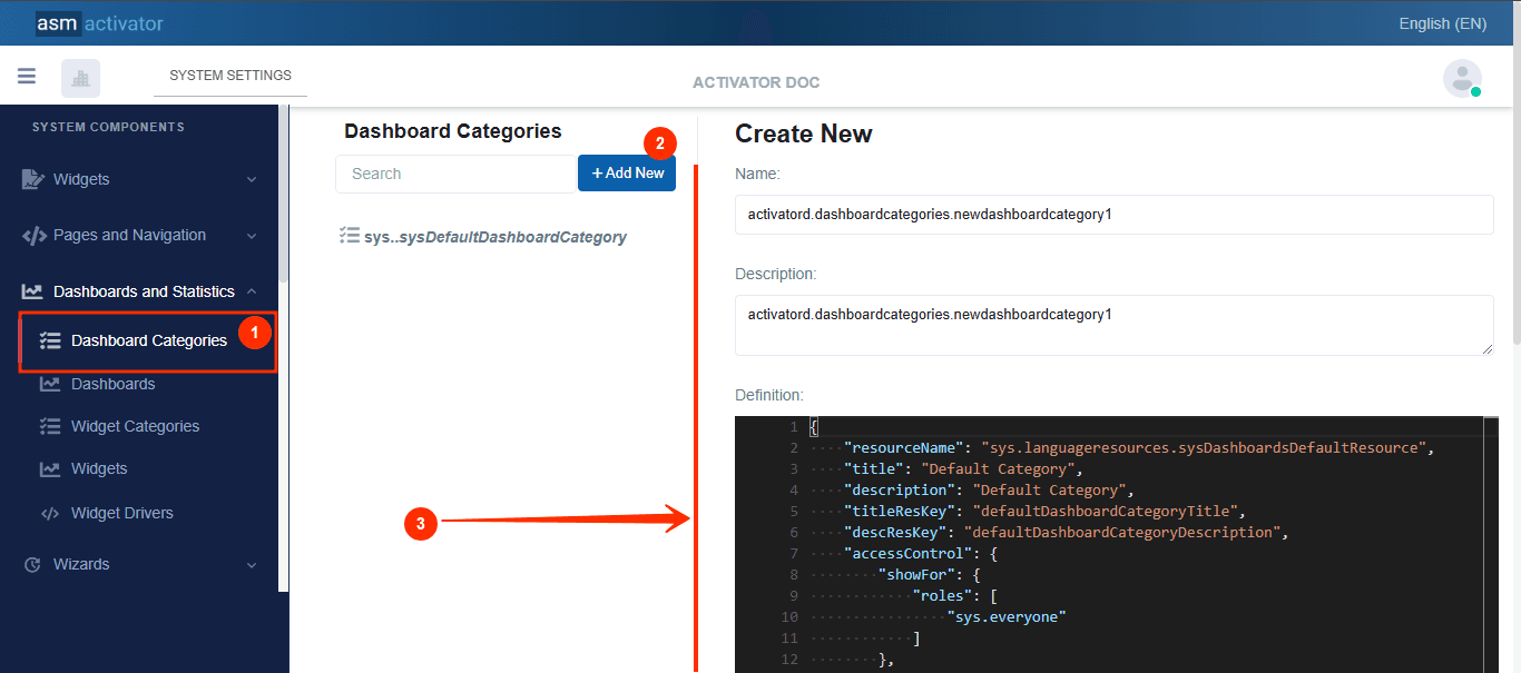
After initiating the creation of the Dasboard category, by clicking on the +Add new button (illustrated at (2) on the image above), you’ll observe a form (illustrated at (3) on the image above) appearing on the right side with some fields.
🔬After filling in the name and description fields, let's focus on the Definition and Meta Data fields.
The Meta Data field gathers and provides additional information for the component, such as configuration and parameters, as well as the accessibility and security measures associated with this component. Please refer to Meta Data for the complete list of additional information related to this component.
As for the Definition field, let's take a closer look at its JSON content.
{
    "resourceName": "sys.languageresources.sysDashboardsDefaultResource",
    "title": "Default Category",
    "description": "Default Category",
    "titleResKey": "defaultDashboardCategoryTitle",
    "descResKey": "defaultDashboardCategoryDescription",
    "accessControl": {
        "showFor": {
            "roles": [
                "sys.everyone"
            ]
        },
        "hideFor": {
            "roles": []
        }
    }
}
Description
| PROPERTY | REQUIRED | DEFAULT VALUE | DESCRIPTION |
|---|---|---|---|
resourceName | Yes | sys.languageresources.sysDashboardsDefaultResource | Represents the associated language resource. |
title | No | Default Category | Dasboard category title. |
description | No | Default Category | Dashboard category description |
titleResKey | No | defaultDashboardCategoryTitle | Resource language key of the title. |
descResKey | No | defaultDashboardCategoryDescription | Resource language key for the description. |
accessControl | No | | This allows configuring the security aspect regarding the visibility of a dashboard category on Activator Client. This object contains 2 properties: ⚠️Exception: The value 📒NOTE: For restrictions on attribute values for certain roles, the |
Dasboards
This component represents the actual dashboards rendered within the Activator Client. It serves as the framework for displaying multiple widgets, each offering distinct functionalities and insights.
Creation
In Activator Admin , the Dasboard component is located within the menu container, among the items listed under Dashboard and Statistics📈. As shown at (1) on the image below.
NB🚦: Make sure you are in the System Component main module.
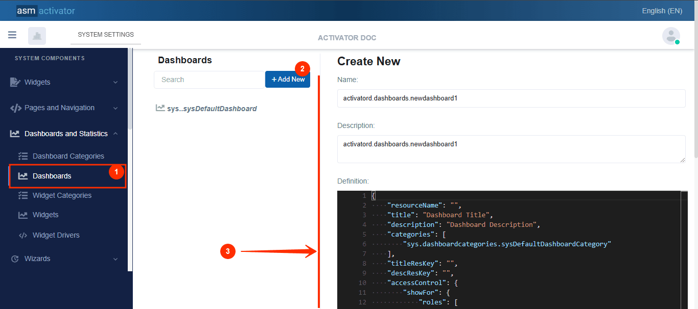
After initiating the creation of the Dasboard, by clicking on the +Add new button (illustrated at (2) on the image above), you’ll observe a form (illustrated at (3) on the image above) appearing on the right side with some fields.
🔬After filling in the name and description fields, let's focus on the Definition and Meta Data fields.
The Meta Data field gathers and provides additional information for the component, such as configuration and parameters, as well as the accessibility and security measures associated with this component. Please refer to Meta Data for the complete list of additional information related to this component.
As for the Definition field, let's take a closer look at its JSON content.
{
    "resourceName": "",
    "title": "Dashboard Title",
    "description": "Dashboard Description",
    "categories": [
        "sys.dashboardcategories.sysDefaultDashboardCategory"
    ],
    "titleResKey": "",
    "descResKey": "",
    "accessControl": {
        "showFor": {
            "roles": [
                "sys.everyone"
            ]
        },
        "hideFor": {
            "roles": []
        }
    },
    "rows": [
        {
            "id": "row1",
            "index": 0,
            "cssClass": "row mb-4",
            "columns": [
                {
                    "id": "row1Col1",
                    "index": 0,
                    "title": "Colunm Title",
                    "resourceName": "",
                    "titleResKey": "",
                    "showTitle": false,
                    "cssClass": "",
                    "colspan": {
                        "mobile": "1",
                        "tablet": "1",
                        "pc": "6",
                        "pcLarge": "6"
                    },
                    "widget": ""
                },
                {
                    "id": "row1Col2",
                    "index": 1,
                    "title": "Colunm Title",
                    "resourceName": "",
                    "titleResKey": "",
                    "showTitle": false,
                    "cssClass": "",
                    "colspan": {
                        "mobile": "1",
                        "tablet": "1",
                        "pc": "6",
                        "pcLarge": "6"
                    },
                    "widget": ""
                }
            ]
        },
        {
            "id": "row2",
            "index": 1,
            "cssClass": "row mb-4",
            "columns": [
                {
                    "id": "row2Col1",
                    "index": 0,
                    "title": "Colunm Title",
                    "resourceName": "",
                    "titleResKey": "",
                    "showTitle": false,
                    "cssClass": "",
                    "colspan": {
                        "mobile": "1",
                        "tablet": "1",
                        "pc": "12",
                        "pcLarge": "12"
                    },
                    "widget": ""
                }
            ]
        }
    ]
}
For clarity, let's break down this code into two sections:
The main container
The structure of the main container is defined by all the properties present at the root of the JSON object.
{
    "resourceName": "",
    "title": "Dashboard Title",
    "description": "Dashboard Description",
    "categories": [
        "sys.dashboardcategories.sysDefaultDashboardCategory"
    ],
    "titleResKey": "",
    "descResKey": "",
    "accessControl": {
        "showFor": {
            "roles": [
                "sys.everyone"
            ]
        },
        "hideFor": {
            "roles": []
        }
    },
    "rows": [ /* List of rows, each containing their own columns */ ]
}
| PROPERTY | REQUIRED | DEFAULT VALUE | DESCRIPTION |
|---|---|---|---|
resourceName | Yes | "" | Represents the associated language resource. |
title | No | Dashboard Title | Dasboard title. |
categories | Yes | sys.dashboardcategories.sysDefaultDashboardCategory | This property lists the different categories to which a dashboard belongs. Defined as an array, it allows a dashboard to be associated with one or more category/ies. |
description | No | Dashboard Description | Dashboard description |
titleResKey | No | "" | Resource language key of the title. |
descResKey | No | "" | Resource language key for the description. |
accessControl | No | | This allows configuring the security aspect regarding the visibility of a dashboard on Activator Client. This object contains 2 properties: ⚠️Exception: The value 📒NOTE: For restrictions on attribute values for certain roles, the |
rows | Yes | | This is where we define our grids. This field allows us to first specify the rows, which in turn will contain (or not) columns. |
After completing the information specific to the main container, let's now focus on its content.
The content of the main container
At this stage, it involves creating the actual grids. In other words, we will need to create one (or more) rows, and then define the columns each row will contain.
Dasboard Row
🔬Let's take a closer look at the fields involved in defining a row.
{
    "id": "row1",
    "index": 0,
    "cssClass": "row mb-4",
    "columns": [ /* List of columns, each indicating their own content provider */ ]
}
| PROPERTY | REQUIRED | DEFAULT VALUE | DESCRIPTION |
|---|---|---|---|
id | Yes | row1, row2, etc... | The value used to uniquely identify the row. |
index | Yes | 0 | Defines the display order of the row, from top to bottom, in ascending order. |
cssClass | No | row mb-4 | Allows adding a CSS class to give the desired style to the Dashboard. |
columns | Yes | | This is where we define the grids. This field allows us to specify the columns of this row |
Dashboard columns
🔬Let's examine the specific fields that are used to define a column.
{
    "id": "row1Col1",
    "index": 0,
    "title": "Colunm Title",
    "resourceName": "",
    "titleResKey": "",
    "showTitle": false,
    "cssClass": "",
    "colspan": {
        "mobile": "1",
        "tablet": "1",
        "pc": "6",
        "pcLarge": "6"
    },
    "widget": ""
}
| PROPERTY | REQUIRED | DEFAULT VALUE | DESCRIPTION |
|---|---|---|---|
id | Yes | row1Col1, row1Col2, row2Col1, etc... | The value used to uniquely identify the column |
index | Yes | 0 | Defines the display order of the column, from left to right, in ascending order |
title | No | column Title | The column title |
ressourceName | No | "" | Represents the associated language resource. |
titleResKey | No | "" | Translation key of the column title |
showTitle | No | false | Specifies whether to display the column title or not |
cssClass | No | "" | Allows adding a CSS class to give the desired style to the dashboard column. |
colspan | Yes | | This property applies to a dashboard column and manages responsiveness based on the different devices specified in the object. It defines the column's width relative to a 12-column grid system, dynamically adapting to the size of its container. For example, on a mobile device, a value of 1 means the column occupies 1/12th of the container's width, while on a PC or PC Large, a value of 6 indicates that it spans 6/12 (half of the container). |
widget | No | "" | This is the name of the widget that will be executed in this column. |
Widget Category
This component is used to classify various widgets into categories. For instance, developers can create widget categories for pie charts, tables, histograms, and more. This categorization facilitates better organization and simplifies the selection and reuse of widgets across dashboards.
Creation
In Activator Admin , the widget category component is located within the menu container, among the items listed under Dashboard and Statistics📈. As shown at (1) on the image below.
NB🚦: Make sure you are in the System Component main module.
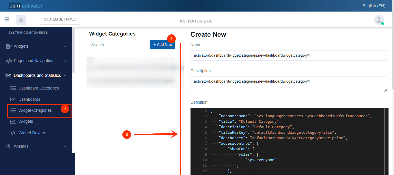
After initiating the creation of the widget category, by clicking on the +Add new button (illustrated at (2) on the image above), you’ll observe a form (illustrated at (3) on the image above) appearing on the right side with some fields.
🔬After filling in the name and description fields, let's focus on the Definition and Meta Data fields.
The Meta Data field gathers and provides additional information for the component, such as configuration and parameters, as well as the accessibility and security measures associated with this component. Please refer to Meta Data for the complete list of additional information related to this component.
As for the Definition field, let's take a closer look at its JSON content.
{
    "resourceName": "sys.languageresources.sysDashboardsDefaultResource",
    "title": "Default Category",
    "description": "Default Category",
    "titleResKey": "defaultDashboardWidgetCategoryTitle",
    "descResKey": "defaultDashboardWidgetCategoryDescription",
    "accessControl": {
        "showFor": {
            "roles": [
                "sys.everyone"
            ]
        },
        "hideFor": {
            "roles": []
        }
    }
}
Description
| PROPERTY | REQUIRED | DEFAULT VALUE | DESCRIPTION |
|---|---|---|---|
resourceName | Yes | sys.languageresources.sysDashboardsDefaultResource | Represents the associated language resource. |
title | No | Default Category | Widget category title. |
description | No | Default Category | Widget category description |
titleResKey | No | defaultDashboardCategoryWidgetTitle | Resource language key of the title. |
descResKey | No | defaultDashboardCategoryWidgetDescription | Resource language key for the description. |
accessControl | No | | This allows configuring the security aspect regarding the visibility of a widget category on Activator Client. This object contains 2 properties: ⚠️Exception: The value 📒NOTE: For restrictions on attribute values for certain roles, the |
Widget
This component is responsible for displaying specific information in a visual and interactive manner. Widgets can represent various types of data, such as charts, counters, lists, or other informational elements. They enable users to monitor key performance indicators (KPIs) and other critical metrics, providing an intuitive and engaging way to analyze and interact with data.
Creation
In Activator Admin , the widget category component is located within the menu container, among the items listed under Dashboard and Statistics📈. As shown at (1) on the image below.
NB🚦: Make sure you are in the System Component main module.
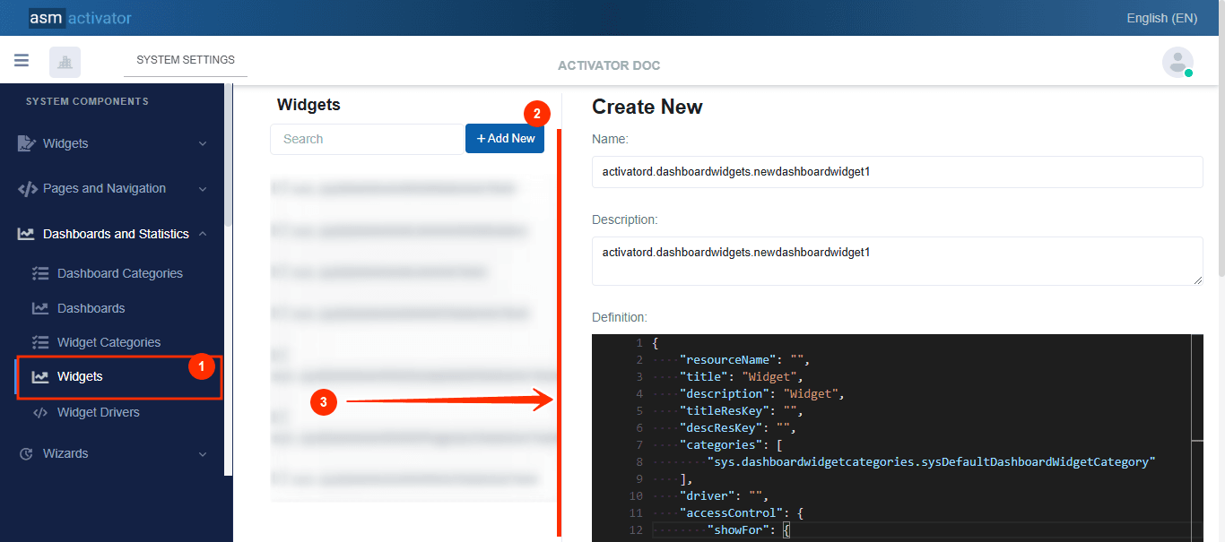
After initiating the creation of the widget, by clicking on the +Add new button (illustrated at (2) on the image above), you’ll observe a form (illustrated at (3) on the image above) appearing on the right side with some fields.
🔬After filling in the name and description fields, let's focus on the Definition and Meta Data fields.
The Meta Data field gathers and provides additional information for the component, such as configuration and parameters, as well as the accessibility and security measures associated with this component. Please refer to Meta Data for the complete list of additional information related to this component.
As for the Definition field, let's take a closer look at its JSON content.
{
    "resourceName": "",
    "title": "Widget",
    "description": "Widget",
    "titleResKey": "",
    "descResKey": "",
    "categories": [
        "sys.dashboardwidgetcategories.sysDefaultDashboardWidgetCategory"
    ],
    "driver": "",
    "accessControl": {
        "showFor": {
            "roles": [
                "sys.everyone"
            ]
        },
        "hideFor": {
            "roles": []
        }
    }
}
Description
| PROPERTY | REQUIRED | DEFAULT VALUE | DESCRIPTION |
|---|---|---|---|
resourceName | Yes | "" | Represents the associated language resource. |
title | No | Widget | Widget category title. |
description | No | Widget | Widget description |
titleResKey | No | "" | Resource language key of the title. |
descResKey | No | "" | Resource language key for the description. |
categories | Yes | sys.dashboardwidgetcategories.sysDefaultDashboardWidgetCategory | This property lists the various widget categories to which a widget belongs. Defined as an array, it allows you to associate a widget with one or more category(ies). |
driver | No | "" | |
accessControl | No | | This allows configuring the security aspect regarding the visibility of a widget category on Activator Client. This object contains 2 properties: ⚠️Exception: The value 📒NOTE: For restrictions on attribute values for certain roles, the |
Widget Driver
This component allows developers to define the visual representation of the widget. It determines how the widget's data and behavior are translated into a graphical interface, ensuring that the widget is both visually appealing and functionally effective. By customizing the driver, developers can tailor the widget's appearance and interaction to align with specific requirements or use cases.
Creation
In Activator Admin , the widget driver component is located within the menu container, among the items listed under Dashboard and Statistics📈. As shown at (1) on the image below.
NB🚦: Make sure you are in the System Component main module.
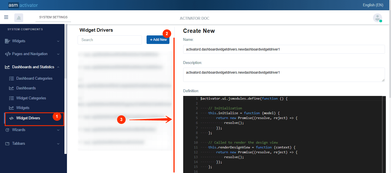
After initiating the creation of the widget driver, by clicking on the +Add new button (illustrated at (2) on the image above), you’ll observe a form (illustrated at (3) on the image above) appearing on the right side with some fields.
🔬After filling in the name and description fields, let's focus on the Definition and Meta Data fields.
The Meta Data field gathers and provides additional information for the component, such as configuration and parameters, as well as the accessibility and security measures associated with this component. Please refer to Meta Data for the complete list of additional information related to this component.
As for the Definition field, let's take a closer look at its JavaScript content.
$activator.ui.jsmodules.define(function () {

    // Initialization
    this.initialize = function (model) {
        return new Promise((resolve, reject) => {
            resolve();
        });
    };

    // Called to render the design view
    this.renderDesignView = function (context) {
        return new Promise((resolve, reject) => {
            resolve();
        });
    };


    // Called to render the runtime view
    this.renderRuntimeView = function (context) {
        return new Promise((resolve, reject) => {
            resolve();
        });
    };

});
Driver Configuration
The driver configuration defines the core logic for the initialization and rendering of widgets in both design and runtime contexts. It consists of three key methods, each serving a specific function to ensure a smooth user experience with the widgets:
initialize():This method handles the initialization of the component. It configures the necessary environment for the widget to function properly and ensures that all dependencies are ready for subsequent operations.
renderDesignView(context):This method is responsible for rendering the illustrative or preview view of the widget. It displays the widget without using real data, offering a visual representation of its layout and functionality. This view is particularly useful when widgets are listed or selected during the dashboard configuration by a user.
renderRuntimeView(context):This method manages the actual rendering of the widget with real-time data. It is triggered at runtime to retrieve data from the database (via a
GETrequest or other means) and populate the widget with live information. This is the key function for delivering the widget’s intended functionality during regular operations.
By structuring the driver logic into these three methods, the system ensures a clear separation between initialization, design-time representation, and runtime functionality, thus improving modularity and maintainability.
How To Instanciate A Dashboard
To instantiate a dashboard, the following method is used:
$activator.ui.renderDashboard({
    container: "",  // The JQuery DOM container where the dashboard will be rendered
    name: "",       // The name of the dashboard
    model: {
        // Provide the necessary data for the dashboard here
        // If the dashboard does not require any parameters, simply pass an empty object {}
    }
}).then((dashboard) => {
    // Actions to perform once the dashboard is successfully rendered
});
✋IMPORTANT: Dashboard instantiate can be done anywhere in component of type Driver (Helper, Content Provider, Driver, Menu Item Driver, #Tabbar Driver, etc…).
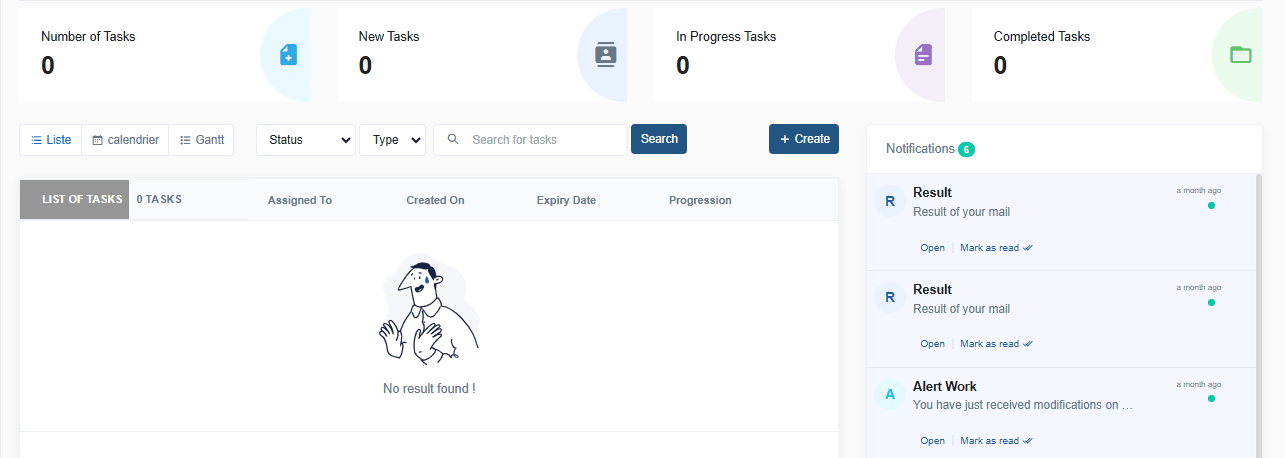
Viewing Dashboards On Activator Client
A view of an example dashboard👇 :
Conclusion
The dashboard component in Activator allows for the centralization and display of key information through interactive and customizable widgets. With features like dashboard and widget categorization, along with responsive management, it provides a flexible user experience adaptable to different devices. By combining initialization, design view, and runtime view, it ensures a smooth and dynamic presentation of data, thus facilitating decision-making and business process management.