Menu Items
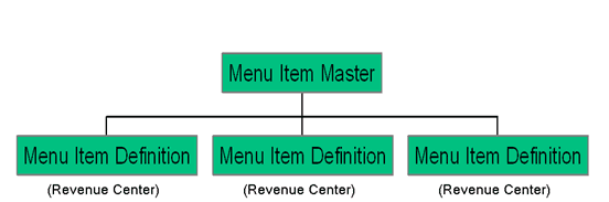
Menu items are fundamental components represented as distinct and clickable links within a menu section in Activator Client. They are designed to organize and present key features or actions of a module in a clear and structured manner, facilitating navigation and use of the platform. Their design in Activator Admin is particularly important to ensure an optimal experience by contributing to the clarity, accessibility, and scalability of the component (these features). Thus, understanding menu items and their proper use is essential for mastering the Activator environment.
Menu Items in Activator Client
Once you have selected the navigation menu you want to access, you will find a list of menu items within the menu container. These items are organized according to the menu sections to which they belong. In other words, the different options or functionalities are grouped under specific sections in the menu, making it easier to find and access the items you are looking for.
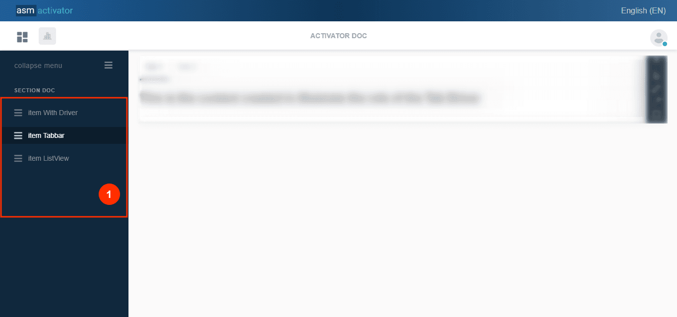
- (1) represents a list of menu items contained in the menu section MENU DOC.
Menu Items in Activator Admin
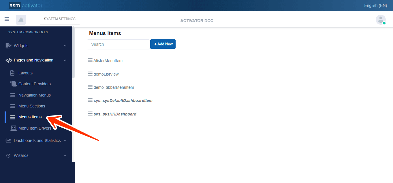
In Activator Admin, the "MENU ITEMS" module is located in the menu container, among the elements listed under </>Pages and Navigation.
✍️Note: Ensure that you are in the main module of system components.
Creation of Menu Items
In Activator Admin, the creation of menu items stems from multiple properties defined to confer specific functionalities. These properties serve as a basis for determining the role and behavior of each menu item in the system according to the needs of a module and its users.
To initiate the creation of a menu item, simply click the +Add New button. Upon clicking, you will notice a change in the display interface of the menu item section, with the addition of various elements allowing for the configuration of properties associated with the menu item.
Configuration of Menu Items
The various elements to define for configuring the menu items are:
• Name: (Modify only the part with: newnavigationmenuitem1)
• Description: (Modify only the part with: newnavigationmenuitem1)
• Definition: default JSON content for this section is:
{
  "resourceName": "",
  "title": "MenuItem",
  "description": "Navigation Menu Item",
  "index": "0",
  "menu": "",
  "layout": "",
  "driver": "",
  "titleResKey": "",
  "descResKey": "",
  "accessControl": {
    "showFor": {
      "roles": [
        "sys.everyone"
      ]
    },
    "hideFor": {
      "roles": []
    }
  }
}
Defining the properties of the JSON content involves assigning specific values to each property based on what is described in this table:
| PROPERTY | REQUIRED | DEFAULT VALUE | DESCRIPTION |
|---|---|---|---|
"ressourceName" | No | By default, this property has an empty value. | Represents the associated language resource. |
"title" | Yes | "MenuItem" | Default menu item title |
"description" | Yes | "Navigation Menu Item" | Allows providing the description of the section item. |
"index" | Yes | "0" | Allows structuring and organizing the display order (in ascending order) of menu items belonging to the same menu section. |
"layout" | Yes(If the driver is not defined.) | By default, this property has an empty value. | Please provide the name of the layout . |
"driver" | Yes(If the layout is not defined.) | By default, this property has an empty value. | Please provide the name of the driver . |
"titleResKey" | No | By default, this property has an empty value. | Language key of the resource for the title. |
"descResKey" | No | By default, this property has an empty value. | Language key of the resource for the description. |
"accessControl" | Yes | | This allows configuring security aspects regarding the visibility of this component on Activator Client. This object contains 2 properties: Exception: The value "sys.everyone" in the roles table (of the "showFor" property in the left table) allows applying this condition to all users in the tenant. NOTE: For restrictions on attribute values for certain roles, the "roleFilter" property must be used on the same row as "role". |
- Meta Data: In the Meta Data section of your Navigation Menu, the JSON file appears as follows:
{
    "ui": {
        "cssClass": "",
        "icon": "fas fa-bars"
    },
    "tags": [],
    "settings": [],
    "accessControl": {
        "read": {
            "roles": [
                "sys.everyone"
            ],
            "roleFilters": [],
            "optionStrict": false
        },
        "modify": {
            "roles": [
                "sys.everyone"
            ],
            "roleFilters": [],
            "optionStrict": false
        },
        "delete": {
            "roles": [
                "sys.everyone"
            ],
            "roleFilters": [],
            "optionStrict": false
        }
    }
}
These properties characterize:
- "ui" which contains a Json object with two other properties: "cssClass" and "icon."
• "cssClass": allows you to add a CSS class to give the desired style to the navigation menu.
• "icon": will associate an icon with the navigation menu name, visible from Activator Client.
- “tags”:/****************/
- “settings”:/***********************/
✍️ NB : This property only accepts two types of icons:
• the Font Awesome Free 5.5.0 icons by @fontawesome - https://fontawesome.com
• /**********************************/
- The accessControl property illustrated by:
"accessControl": {
        "read": {
            "roles": [
                "sys.everyone"
            ],
            "roleFilters": [],
            "optionStrict": false
        },
        "modify": {
            "roles": [
                "sys.everyone"
            ],
            "roleFilters": [],
            "optionStrict": false
        },
        "delete": {
            "roles": [
                "sys.everyone"
            ],
            "roleFilters": [],
            "optionStrict": false
        }
    }
Defines the access permissions of the component manager for this menu item. In the case of creation, it specifies permissions for reading, modifying, and deleting through the properties read, modify, and delete of the accessControl object. Each property of accessControl also has three sorting properties (categorizing each action performed on the menu according to users), which are:
• "roles": [sys.everyone], granting access to the roles that will be assigned. By default, all users with the sys.everyone role will have access to reading, modifying, and deleting for this menu item.
• "roleFilters": []/*******************/
• "optionStrict": false, By default it is set to false but can take true as another value. This property allows defining the hierarchy of roles on the menu.
✋IMPORTANT
If the value of optionStrict is true, it means that a user with a higher or lower role will not have the right to perform the actions that you can perform. Conversely, when the value is false, only users with a higher role will have the right to perform the actions that you can perform.
To better understand, visit the Role Hierarchy.
Modification of a Navigation Menu
Once you have accessed it, understand that the configurations you made during the creation of the menu in the Definition section will now be contained in the Source tab, and those made in the meta data section will now be in the Additional Info tab.
Conclusion
Menu items are essential components in structuring and presenting a module's features within the Activator ecosystem. They allow users to navigate easily and intuitively through a clear and organized arrangement of available options and actions. The Activator admin interface enables developers to define and configure these menu items in detail, ensuring an optimal user experience. Additionally, the ability to customize the security and metadata properties for each menu item ensures flexible management tailored to the specific needs of users, thereby facilitating the platform's evolution and maintenance.