Navigation Menu
👨💻The Navigation Menu component in Activator serves as a crucial element for organizing and accessing different modules. It provides users with a structured interface to navigate through various features and functions of the system efficiently. This component not only enhances the user experience by making navigation intuitive but also allows developers to customize and configure the menu to align with specific organizational needs.
Navigation Menu On Activator Client
In Activator, navigation menu creation is done through Activator Admin, where users can design and configure menus according to their specific needs. Once the menus are created and customized in Activator Admin, the rendering of these menus can be directly viewed in Activator Client.
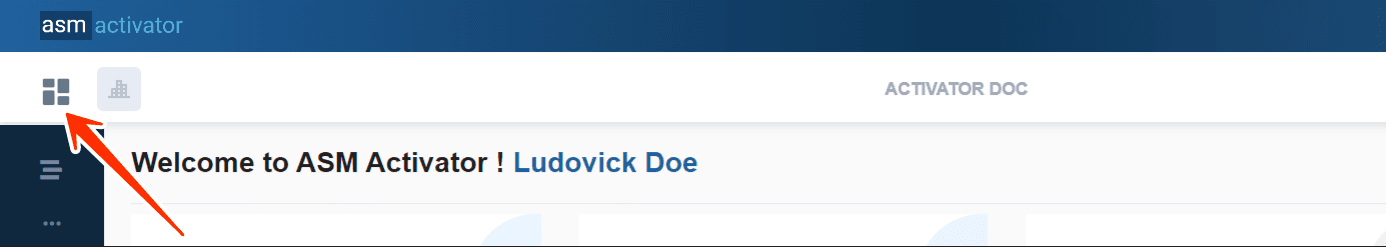
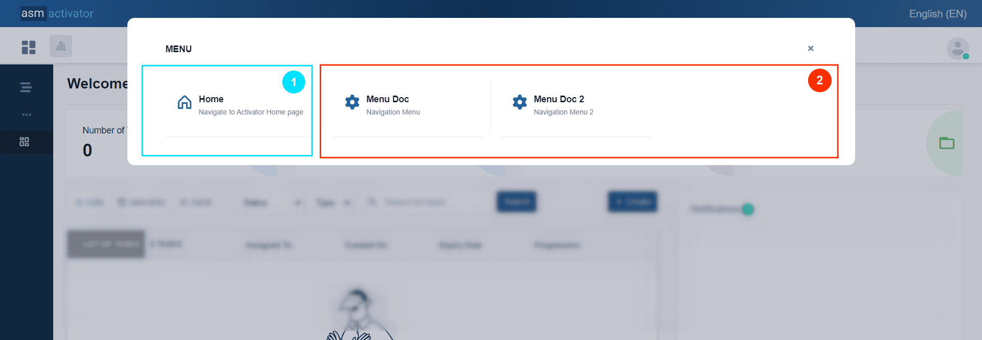
Viewing (based on your roles and privileges) on Activator Client, the Navigation Menus created from Activator Admin is done by clicking on the Change Modules button, and a popup containing the different navigation menus will open, as shown in the following two images.
✋IMPORTANT
• (1)The 🏠Home menu is the default menu provided by the system; it allows users to navigate back to the home page of Activator Client.
• (2) List of menus related to the various modules configured by the tenant. Additionally, this list will also contain the different navigation menus of the modules included in the tenant's license.
Create A Navigation Menu
In Activator Admin , the Navigation Menu component is located within the menu container, among the items listed under </>Pages and Navigation. As shown at (1) on the image below.
✋CAUTION
Make sure you are in the System Component main module
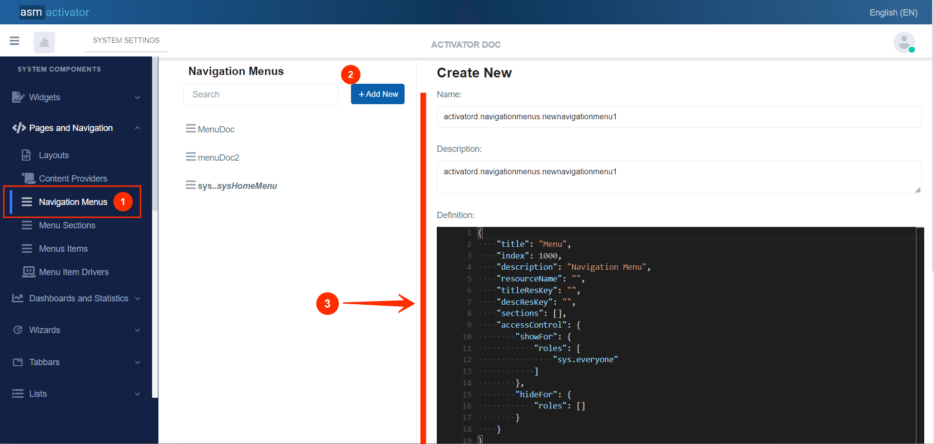
To initiate the creation of a Navigation Menu component, simply click on the +Add new button (illustrated at (2) on the image above). Upon clicking, you’ll observe a form (illustrated at (3) on the image above) appearing on the right side with some fields.
🔬After filling in the name and description fields, let's focus on the Definition and Meta Data fields.
The Meta Data field gathers and provides additional information for the component, such as configuration and parameters, as well as the accessibility and security measures associated with this component. Please refer to Meta Data for the complete list of additional information related to this component.
As for the Definition field, let's take a closer look at its JSON content. Notice that it's here where you will be prompted to fill in various fields. These fields will be used to specify information relating to the identification of the Navigation Menu and its Menu Sections.
{
    "title": "Menu",
    "index": 1000,
    "description": "Navigation Menu",
    "resourceName": "",
    "titleResKey": "",
    "descResKey": "",
    "sections": [],
    "accessControl": {
        "showFor": {
            "roles": [
                "sys.everyone"
            ]
        },
        "hideFor": {
            "roles": []
        }
    }
}
| PROPERTY | REQUIRED | DEFAULT VALUE | DESCRIPTION |
|---|---|---|---|
title | Yes | Menu | Menu title. |
index | Yes | 1000 | This defines the display order of the Navigation Menus, from left to right, in ascending order. |
description | No | Navigation Menu | Menu description. |
resourceName | No | "" | Represents the associated language resource. |
titleResKey | No | "" | Resource language key of the title. |
descResKey | No | "" | Resource language key for the description. |
sections | No | [] | Allows grouping a set of Navigation Menu Sections. Example: |
accessControl | No | | This allows configuring the security aspect regarding the visibility of a Navigation Menu on Activator Client. This object contains 2 properties: ⚠️Exception: The value 📒NOTE: For restrictions on attribute values for certain roles, the |
Conclusion
Navigation Menu component in Activator serves for organizing and accessing the various modules within the system. and ensures that users can easily navigate through different functionalities based on their roles and privileges, making the user experience more streamlined and efficient. With a clear understanding of the Navigation Menu, let's now explore the Navigation Menu Section, which further enhances the modular organization and accessibility of the application