Forms
The Form component of Activator is a powerful tool designed to dynamically and intuitively manage the display and updating of recorded data. It plays a central role in user interfaces by providing a seamless experience for viewing, editing, and validating data. One of the key strengths of this component lies in its ability to support multiple types of input fields, offering exceptional flexibility to meet various functional requirements.
Creating A Form
In Activator, the creation of a form depends mainly on three components: #Forms, Forms Drivers and Input Drivers, each of which plays a specific role. Below is a detailed overview of these three components👇 :
Forms
Le composant Forms constitue le cœur du système. Il est directement responsable de l’affichage, de la collecte et de la manipulation des données associées à un enregistrement spécifique.
Creation
In Activator Admin , the Forms component is located within the menu container, among the items listed under 📑Forms. As shown at (1) on the image below.
NB🚦: Make sure you are in the System Component main module.
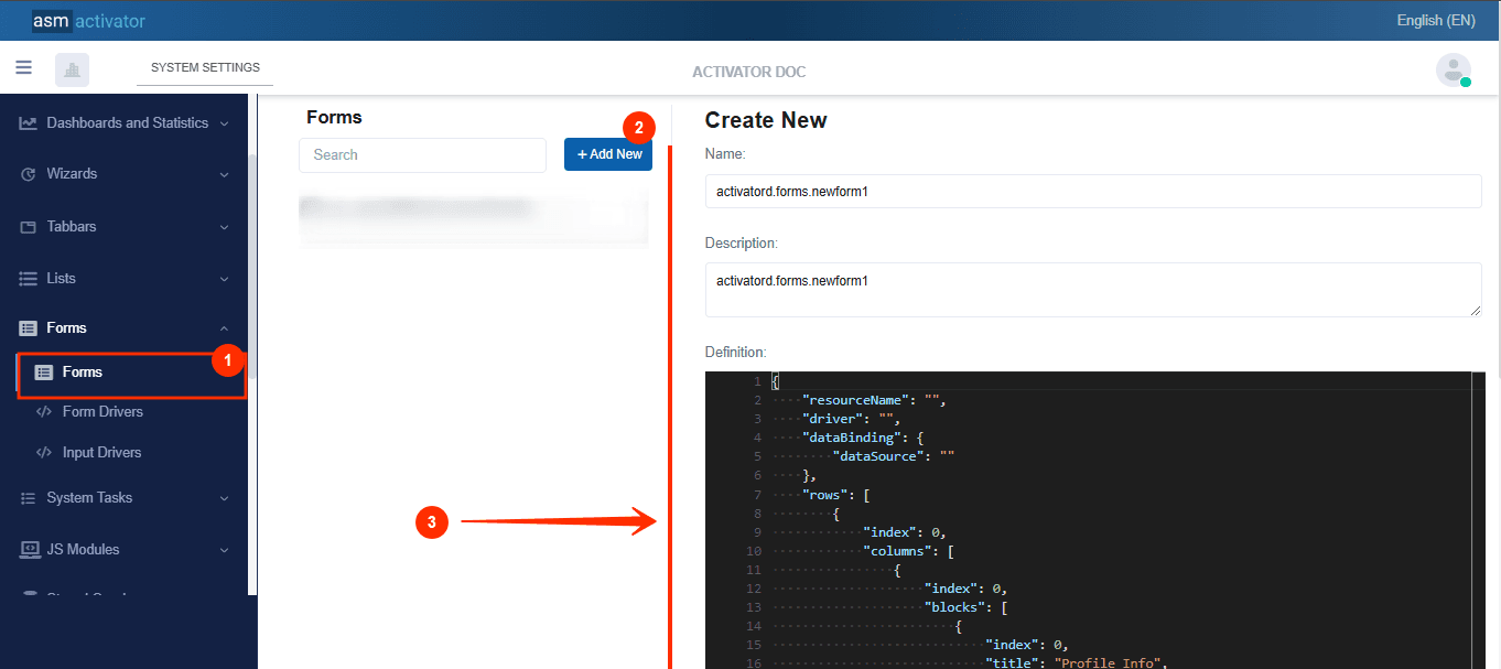
After initiating the creation of the form, by clicking on the +Add new button (illustrated at (2) on the image above), you’ll observe a form (illustrated at (3) on the image above) appearing on the right side with some fields.
🔬After filling in the name and description fields, let's focus on the Definition and Meta Data fields.
The Meta Data field gathers and provides additional information for the component, such as configuration and parameters, as well as the accessibility and security measures associated with this component. Please refer to Meta Data for the complete list of additional information related to this component.
As for the Definition field, let's take a closer look at its JSON content.
{
  "resourceName": "",
  "driver": "",
  "dataBinding": {
    "dataSource": ""
  },
  "rows": [
    {
      "index": 0,
      "columns": [
        {
          "index": 0,
          "blocks": [
            {
              "index": 0,
              "title": "Profile Info",
              "titleResKey": "",
              "inputs": [
                {
                  "name": "firstName",
                  "driver": "sys.forminputdrivers.sysTextbox",
                  "index": 0,
                  "attributes": {
                    "placeholder": "First Name",
                    "requireValue": true,
                    "value": "",
                    "label": "First Name",
                    "labelPosition": "inline",
                    "labelAlignment": "left",
                    "labelResKey": ""
                  },
                  "dataBinding": {
                    "dataMember": "firstName"
                  },
                  "visibleFor": {
                    "roles": [
                      "sys.everyone"
                    ]
                  },
                  "editableFor": {
                    "roles": [
                      "sys.everyone"
                    ]
                  }
                },
                {
                  "name": "lastName",
                  "driver": "sys.forminputdrivers.sysTextbox",
                  "labelResKey": "",
                  "label": "Last Name",
                  "value": "",
                  "index": 1,
                  "required": true,
                  "attributes": {
                    "placeholder": "Last Name",
                    "requireValue": true,
                    "value": "",
                    "label": "Last Name",
                    "labelPosition": "inline",
                    "labelAlignment": "left",
                    "labelResKey": ""
                  },
                  "dataBinding": {
                    "dataMember": "lastName"
                  },
                  "visibleFor": {
                    "roles": [
                      "sys.everyone"
                    ]
                  },
                  "editableFor": {
                    "roles": [
                      "sys.everyone"
                    ]
                  }
                },
                {
                  "name": "state",
                  "driver": "sys.forminputdrivers.sysSelect",
                  "labelResKey": "",
                  "label": "State",
                  "value": "",
                  "index": 1,
                  "required": true,
                  "attributes": {
                    "placeholder": "State",
                    "requireValue": true,
                    "value": "",
                    "label": "State",
                    "labelPosition": "inline",
                    "labelAlignment": "left",
                    "labelResKey": "",
                    "dataBinding": {
                      "dataSource": "",
                      "valueDataMember": "",
                      "textDataMember": ""
                    }
                  },
                  "dataBinding": {
                    "dataMember": "state"
                  },
                  "visibleFor": {
                    "roles": [
                      "sys.everyone"
                    ]
                  },
                  "editableFor": {
                    "roles": [
                      "sys.everyone"
                    ]
                  }
                }
              ]
            }
          ]
        }
      ]
    }
  ]
}
For clarity, let's break down this code into two sections:
The main container
The structure of the main container is defined by all the properties present at the root of the JSON object.
{
  "resourceName": "",
  "driver": "",
  "dataBinding": {
    "dataSource": ""
  },
  "rows": [
/* List of rows, each containing their own columns */]
}
| PROPERTY | REQUIRED | DEFAULLT VALUE | DESCRIPTION |
|---|---|---|---|
resourceName | No | "" | Represents the associated language resource for field labels. |
driver | No | "" | Represents the form driver component used by this form |
dataBinding | No | | The dataSource property allows retrieving data from the system using a stored query or a stored function to obtain the results to display. |
rows | Yes | | This is where we define our grids. This field first allows us to specify rows, which in turn will contain columns. |
After completing the information specific to the main container, let's now focus on its content.
The content of the main container
At this stage, it involves creating the actual grids. In other words, we will need to create one (or more) rows, and then define the columns each row will contain.
Dasboard Row
🔬Let's take a closer look at the fields involved in defining a row.
[
    {
        "index": 0,
        "columns": [/* List of columns, each indicating their own content provider */]
    }
]
| PROPERTY | REQUIRED | DEFAULLT VALUE | DESCRIPTION |
|---|---|---|---|
index | Yes | 0 | Defines the display order of the row, from top to bottom, in ascending order. |
columns | Yes | | This is where we define the grids. This field allows us to specify the columns of this row |
Dashboard columns
🔬Let's examine the specific fields that are used to define a column.
[
    {
        "index": 0,
        "blocks": [
            {
                "index": 0,
                "title": "Profile Info",
                "titleResKey": "",
                "inputs": [/*Used to define the different inputs that a block will contain.*/]
            }
        ]
    }
]
| PROPERTY | REQUIRED | DEFAULLT VALUE | DESCRIPTION |
|---|---|---|---|
index | Yes | 0 | Defines the display order of the row, from top to bottom, in ascending order. |
blocks | Yes | | Table containing “blocks” of content, such as groups of entries or sections.
|
Inputs
Let's take a look at the various properties that enable input to be implemented.
{
    "name": "firstName",
    "driver": "sys.forminputdrivers.sysTextbox",
    "index": 0,
    "attributes": {
        "placeholder": "First Name",
        "requireValue": true,
        "value": "",
        "label": "First Name",
        "labelPosition": "inline",
        "labelAlignment": "left",
        "labelResKey": ""
    },
    "dataBinding": {
        "dataMember": "firstName"
    },
    "visibleFor": {
        "roles": [
            "sys.everyone"
        ]
    },
    "editableFor": {
        "roles": [
            "sys.everyone"
        ]
    }
}
| PROPERTY | REQUIRED | DEFAULLT VALUE | DESCRIPTION |
|---|---|---|---|
name | No | first name | Input name |
driver | Yes | sys.forminputdrivers.sysTextbox | It is responsible for managing data editing for input. |
index | No | 0 | Defines the display order of the block, from top to bottom, in ascending order. |
attributes | Yes | |
|
dataBinding | Yes | | Specifies the label to which the field containing the data is linked for display. |
visibleFor | Yes | | specifies the roles (in the roles property of the left cell) and roleFilters for which the element should be visible. |
editableFor | Yes | | specifies the roles (in the roles property of the left cell) and roleFilters for which the element is to be edited. |
Form Drivers
The Form Drivers component, a type of Driver, acts as a customization and behavioral management engine for forms. It adds an additional layer of logic and control by defining:
- Specific behaviors of form elements: Each field or section can be enhanced with particular behaviors, such as conditional validation, dynamic interaction, and more.
- Parameters and arguments for associated queries: This component allows precise configuration of queries (APIs, databases, etc.) linked to the form, including data retrieval, update, or deletion operations.
Creation
In Activator Admin , the Form driver component is located within the menu container, among the items listed under 📑Forms.. As shown at (1) on the image below.
NB🚦: Make sure you are in the System Component main module.
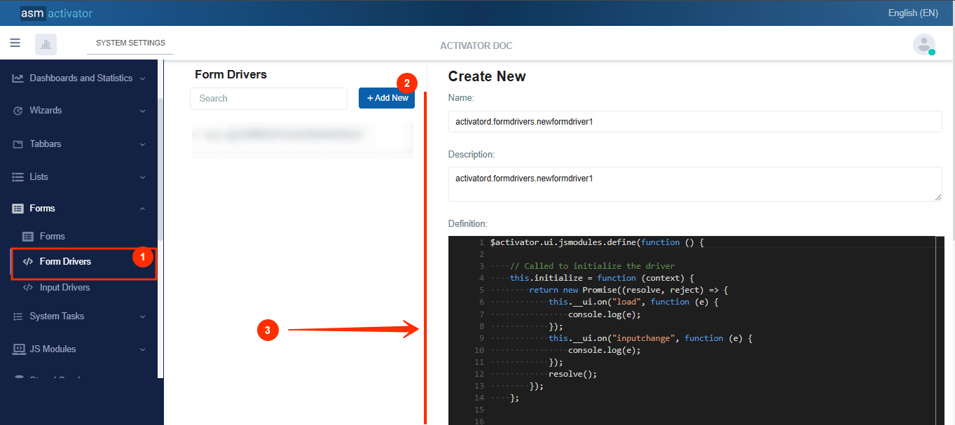
After initiating the creation of the form driver, by clicking on the +Add new button (illustrated at (2) on the image above), you’ll observe a form (illustrated at (3) on the image above) appearing on the right side with some fields.
🔬After filling in the name and description fields, let's focus on the Definition and Meta Data fields.
The Meta Data field gathers and provides additional information for the component, such as configuration and parameters, as well as the accessibility and security measures associated with this component. Please refer to Meta Data for the complete list of additional information related to this component.
As for the Definition field, let's take a closer look at its JavaScript content.
$activator.ui.jsmodules.define(function () {

    // Called to initialize the driver
    this.initialize = function (context) {
        return new Promise((resolve, reject) => {
            this.__ui.on("load", function (e) {
                console.log(e);
            });
            this.__ui.on("inputchange", function (e) {
                console.log(e);
            });
            resolve();
        });
    };


    //Builds the form's data source arguments
    this.buildDataSourceArgs = function (context) {
        return new Promise((resolve, reject) => {
            //for stored functions
            //resolve({
            //    arguments: []
            //});

            //for stored queries
            resolve({
                parameters: []
            });
        });
    };

    //Builds the inputs' data source arguments
    this.buildInputDataSourceArgs = function (context) {
        return new Promise((resolve, reject) => {
            //for stored functions
            //resolve({
            //    arguments: []
            //});

            //for stored queries
            resolve({
                parameters: []
            });
        });
    };

});
Description
The component is defined using the $activator.ui.jsmodules.define method, which registers a JavaScript module within the Activator ecosystem. This module contains several methods for interacting with the form and managing its associated data and events.
The initialize method is used to set up the Form Driver and configure event handlers related to the form's user interface.
Events:
this.__ui.on("load", function (e)): This event is triggered when the form is fully loaded. A log is generated in the console to monitor the event.this.__ui.on("inputchange", function (e)): This event is triggered whenever a form field value changes. Updating the input is handled manually by the developer within the Activator system.
The buildDataSourceArgs method constructs the arguments required for the data source associated with the form. This is particularly important for interacting with stored functions or stored queries.
This method returns a promise that resolves to an object containing the parameters required to interact with a data source. Developers must ensure they pass the correct arguments based on the type of data source linked:
- Stored Query: If a stored query is used in the form, developers should call
resolve({ parameters: [] })to construct the query parameters. - Stored Function: If a stored function is used, developers should call
resolve({ arguments: [] })to build the necessary arguments for the function.
NB🚧: These are the parameters or arguments for the dataBinding passed into the dataSource during the form definition.
buildInputDataSourceArgs method********
Input Driver
Input Drivers are specifically designed to manage data input fields, which are central to any user interaction. They allow for:
- Creating or customizing input fields: Each type of field (text, dropdown, date, file, etc.) can be configured and adapted to meet specific requirements.
- Managing and controlling user interactions.
Creation
In Activator Admin , the Input driver component is located within the menu container, among the items listed under 📑Forms.. As shown at (1) on the image below.
NB🚦: Make sure you are in the System Component main module.
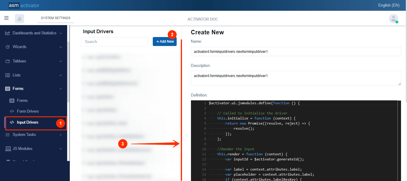
After initiating the creation of the input driver, by clicking on the +Add new button (illustrated at (2) on the image above), you’ll observe a form (illustrated at (3) on the image above) appearing on the right side with some fields.
🔬After filling in the name and description fields, let's focus on the Definition and Meta Data fields.
The Meta Data field gathers and provides additional information for the component, such as configuration and parameters, as well as the accessibility and security measures associated with this component. Please refer to Meta Data for the complete list of additional information related to this component.
As for the Definition field, let's take a closer look at its JavaScript content.
$activator.ui.jsmodules.define(function () {

    // Called to initialize the driver
    this.initialize = function (context) {
        return new Promise((resolve, reject) => {
            resolve();
        });
    };

    //Render the input
    this.render = function (context) {
        var inputId = $activator.generateId();

        var label = context.attributes.label;
        var placeholder = context.attributes.label;
        if (context.attributes.labelResKey) {
            label = $activator.ui.resourceString({ source: "hicardsales.languageresources.formDemo", key: context.attributes.labelResKey });
        }
        if (context.attributes.placeholderResKey) {
            placeholder = $activator.ui.resourceString({ source: "hicardsales.languageresources.formDemo", key: context.attributes.placeholderResKey });
        }
        context.container.empty();
        this.input = $(`<input type="text" class="form-control form-control-sm" name="${context.name}" placeholder="Placeholder" id="input_${inputId}"></input>`);
        context.container.append(`<div class="form-group row mb-1">
            <label id="${inputId}_label" class="col-sm-6 col-form-label input-label">${label}</label>
            <div class="col-sm-6 js-form-message" id="${inputId}_input"></div>
        </div>`);
        $(`#${inputId}_input`).append(this.input);

        this.input.change(function () {
            context.form.raiseEvent({
                eventName: "inputchange",
                eventArg: {
                    name: context.name,
                    value: $(this).val()
                }
            });
        });
    };

    //Sets the value of the input
    this.setValue = function (value) {
        this.input.val(value);
    };

    //Get the current value of the input
    this.getValue = function () {
        return this.input.val();
    };

});
Description
The code above defines an Input Driver within the Activator ecosystem.
| METHOD | DESCRIPTION |
|---|---|
initialize | This method initializes the Input Driver and prepares the necessary context for its operation. |
render | The render method is responsible for the visual display of the input within the form. It dynamically generates the necessary HTML to display an input field with a label and handles value changes. |
setValue | Called to pre-fill a field or dynamically update its value. |
getValue | This method retrieves the current value of the input. |
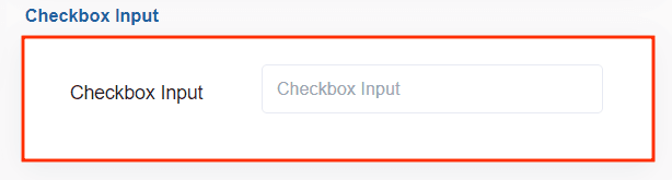
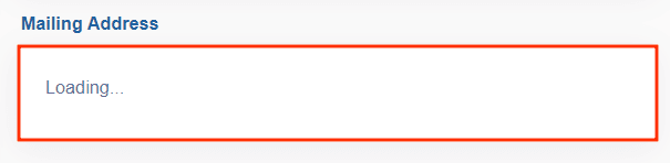
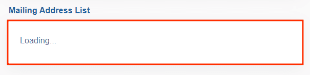
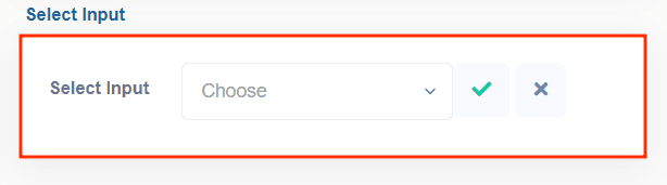
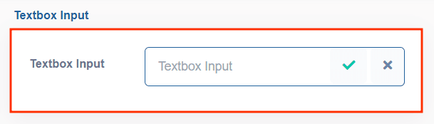
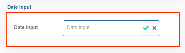
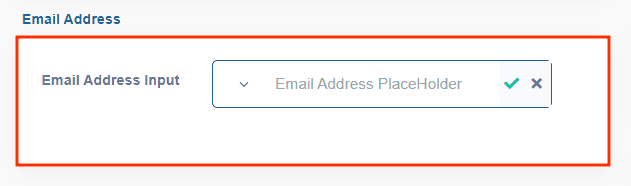
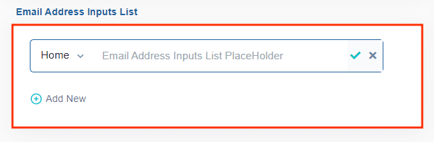
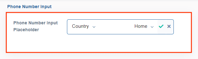
IMPORTANT⛔: Activator already provides a default set of Input Drivers for developers. These inputs are👇:
- Checkbox Input (
sys.forminputdrivers.sysCheckbox):
- Mailing Address (
sys.forminputdrivers.sysMailingAddress):
- Mailing Address List (
sys.forminputdrivers.sysMailingAddressList):
- Select Input (
sys.forminputdrivers.sysSelect):
- Textbox Input (
sys.forminputdrivers.sysTextbox)
- Date Input (
sys.forminputdrivers.sysTextbox_Date):
- Email Address Input (
sys.forminputdrivers.sysTextbox_EmailAddress):
- Email Address Inputs List (
sys.forminputdrivers.sysTextbox_EmailAddressList):
- Phone Number Input (
sys.forminputdrivers.sysTextbox_PhoneNumber):
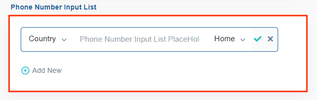
- Phone Number Input List (
sys.forminputdrivers.sysTextbox_PhoneNumberList):
How To Instanciate A Form
To instantiate a form, the following method is used:
$activator.ui.renderForm({
            container: "", // The JQuery DOM container
            name: "", // The form name
            model: {
                // Add the necessary data for the form here
                // If your form does not expect any param, just send an empty object {}
            }
        }).then((form) => {
            //Stuffs to do after the form is rendered
        });
✋IMPORTANT: Form Initialization can be done anywhere in component of type Driver (Helper, Content Provider, Driver, Menu Item Driver, #Tabbar Driver, etc…).
Viewing Forms On Activator Client
Conclusion
The development of the Form, Form Driver, and Input Driver components within the Activator ecosystem highlights a modular, flexible, and user-oriented architecture designed to efficiently handle dynamic and multilingual forms. Each component plays a specific role, enabling a clear separation of responsibilities: from displaying and manipulating data to precise interactions with input fields, and managing behaviors and events. By integrating concepts such as centralized event propagation, multilingual resource management, and adaptability to various data configurations, this approach ensures a smooth user experience while providing developers with powerful tools to build robust, scalable, and maintainable interfaces.
Building on this flexibility and modularity, the List View component offers similar advantages by enabling dynamic, interactive table views with customizable behaviors and data management capabilities.